


Ch.2
EVALUATING HUE SHIFTS IN SPOT COLOR TINTS
Graduate Student – Himanshu Rana
Advisors – Dr. Duncan Darby, Dr. Liam O’Hara, Robert Congdon, Dr. Samuel Ingram
Introduction
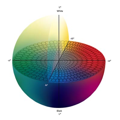
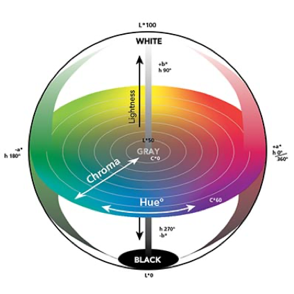
Packaging plays an important role in the modern world. It helps to preserve, protect, dispense, communicate and sell a product. Printing and color are key components of the communication and selling functions. Printing can broadly be classified into two categories on the basis combination of inks being used – process and spot color printing. Process color printing involves use of combinations of process colors – Cyan, Magenta, Yellow and Black (CMYK). Expanded gamut printing is a special case of process printing where additional colors, typically orange, green and violet, are used to achieve a larger color gamut. Spot color printing uses specially formulated inks that are designed to achieve a particular color appearance on a given substrate. The brand colors as commonly printed as spot colors. Different brands use characteristic colors that the consumers can relate to their products and brand identity e.g. a coca cola red or a Pepsi blue. Color can be defined using colorimetric coordinates in a 3-Dimensional (3D) CIELAB space. The L* represents lightness or darkness, a* stands for redness or greenness and b* indicates the yellowness or blueness of a color. These colorimetric coordinates can also be represented in CIELCH space using L*C*h° values, where C* is the chromaticity and h° represents the hue angle of a color. The Studies have suggested a higher visual sensitivity towards hue as compared to saturation and lightness (Danilova & Mollon, 2016) (Durmus & Davis, 2019).
a) Spot Color – Reflex Blue – Printed on
Press to Linear SCTV
b) Esko Equinox converted Reflex Blue – Printed on Press – No curve correction
c) Esko Equinox converted Reflex Blue – Printed to Press – Corrected to Linear SCTV
Images courtesy of Mark Samworth – Esko Graphic Inc.
Scope of the Study
The study was limited to six spot colors on a single paperboard packaging substrate. The study was conducted with water- based inks as these are common for paperboard packaging. Pantone-Live dependent library Flexo Water-Based Coated Paper (FWCP) was used as a digital reference. Other software solutions, although available, were not evaluated under this study. The substrate was chosen based on substrate in the Pantone-Live FWCP library.
Experimental Design
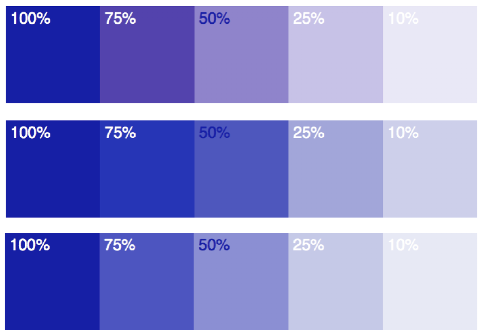
The input variables included six different spot colors, a range of tonal values and two different ink recipes for one of the six spot colors. The selection method and standard values for each color are described in the ink section of methods and materials. The two different ink recipes for the color P4975-FWCP were used to evaluate the effect of different ink recipes on hue shift behavior. The tone scale from 10% to 100% was printed at increments of 10% (with addition of 25%, 50% and 75% patches). The tone scales were printed for all the colors over paper, over a printed black background and in randomized order. The print over black was conducted for opacity calculations, if needed in the future. The patches were also printed in randomized order in case any process bias was recognized in the data. The test chart design and components can be seen in the test chart section of the methods and materials section.
In terms of the output metrics, this study involved quantification of hue shift with three different metrics. ASTM D2244 stated that the difference in hue angle between a sample and specimen could be correlated to the differences in visual perception of these hues, with an exception of very dark colors (ASTM, 2016). Hence, a difference between hue angles of solid and the tints (∆h*ab) was used as the first metric. The calculations were corrected for hue angle shift between quadrants e.g. hue angle moving from 359° to 1°. This metric is referred to as ‘hue angle difference’ in this study. The second metric used in this study was the hue difference called Delta H (∆H*ab). The formula used for calculations was selected based on ISO11664-4 (2019) recommendations.
∆H*ab= 2(C*ab,1•C*ab,0)0.5Sin(∆h*ab/2)
where, ∆H*ab= Delta H or Delta hue as a measure of hue difference
C* = Chromaticity = (a*2 + b*2)1/2
C*ab,0 = Chromaticity of test (tint)
C*ab,1= Chromaticity of solid reference
∆hab= hab,1– hab,0 = Hue Angle Difference
= Hue angle of solid - Hue Angle of tint
While the hue angle difference (∆h*ab) as an individual metric was calculated and analyzed in degrees, the hue difference (∆H*ab) formula requires the (∆h*ab) to be in radians.
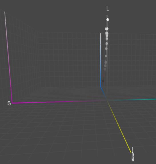
A new metric was also developed in this study to characterize hue shift. The third metric used in the study was the shortest distance between the tint and a line joining paper white point and the solid in a CIELAB space. To understand the orthogonal distance calculation, please refer the image below
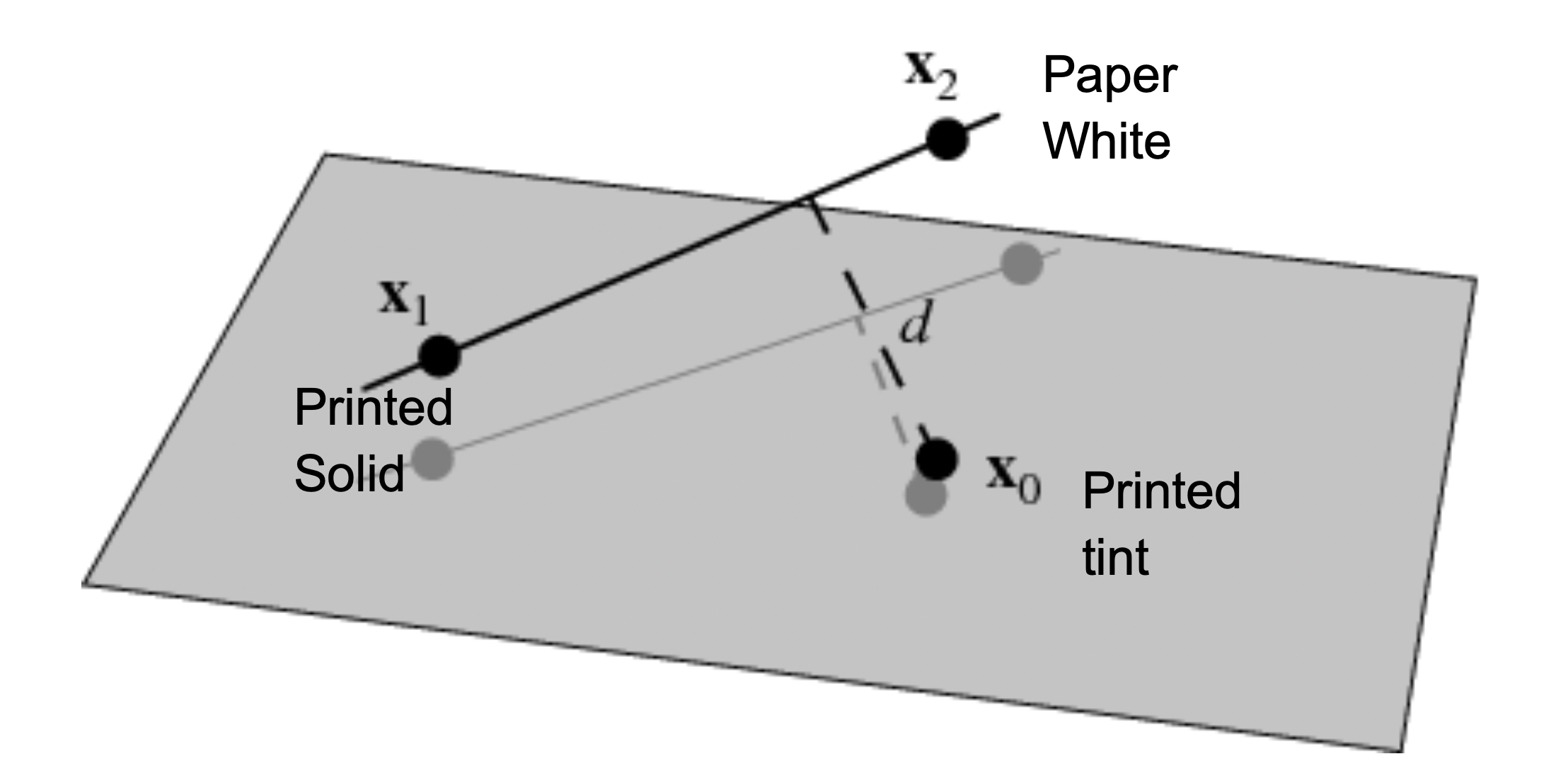
X1 = L*a*b* coordinates of solid = (L1, a1, b1)
X2 = L*a*b*coordinates of paper = (L2, a2, b2)
X0 = L*a*b* coordinates of tint = (L0, a0, b0)
The shortest distance between the point X0 and the line connecting the solid to the paper white point in 3D space is represented by the orthogonal distance between the point X0 and line vector (X1 X2). This distance is calculated using the formula below:
d=|(X2-X1)×(X1-X0)|/|(X1-X0)|
where, |(X2-X1)×(X1-X0)| is the magnitude of the cross product of the two terms and |(X1-X0)| = √((L1-L0)2 + (a1-a0)2 + (b1-00)2) which is the magnitude of the substraction of vector X0 from X1 (Weisstein, 2020).
The input variables and their corresponding levels along with the output variable and corresponding metrics are summarized in Table 1.
|
Input Variables |
Levels |
|
Color |
6 Spot Colors – Red (P485-FWCP), Green (P357-FWCP), Blue (PReflex Blue-FWCP), Orange (POrange021 – FWCP), Purple (P261-FWCP), and Brown (P4975-FWCP) |
|
Ink Recipe |
2 ink recipes with different base pigments |
|
Tone Value |
11 levels - 10, 20, 25, 30, 40, 50, 60, 70, 75, 80 and 90% |
|
Output Variables |
Metrics |
|
Hue Shift |
Hue Angle Difference , Hue Difference or Delta H , Orthogonal Distance (OD) |
Methods and Materials
Substrate
The study was conducted on Westrock 12 point (pt) PrintKote paperboard substrate. This paper was selected in accordance to the white point of the PantoneLIVE digital library used as a reference in this study. Paperboard substrate is widely used in packaging applications.
Inks
Paperboard substrates are commonly printed with water based inks for a wide variety of packaging applications, mainly in the food industry. The colors of the inks for this study were selected based on the data collected from a preliminary press run, PantoneLIVE data, and spot color usage statistics obtained from four pre-press agencies. The colorimetric data from the preliminary study involving six different spot colors was analyzed for hue shift across the tonal range. The six spot colors printed in the preliminary study were P33%C(light yellow), P2706C (light blue), P1485C (light orange), P187C (dark red), P357C (dark green), and P2685C (dark violet). Hue angle difference and Delta H were used as metrics. This data is presented in the figure below.
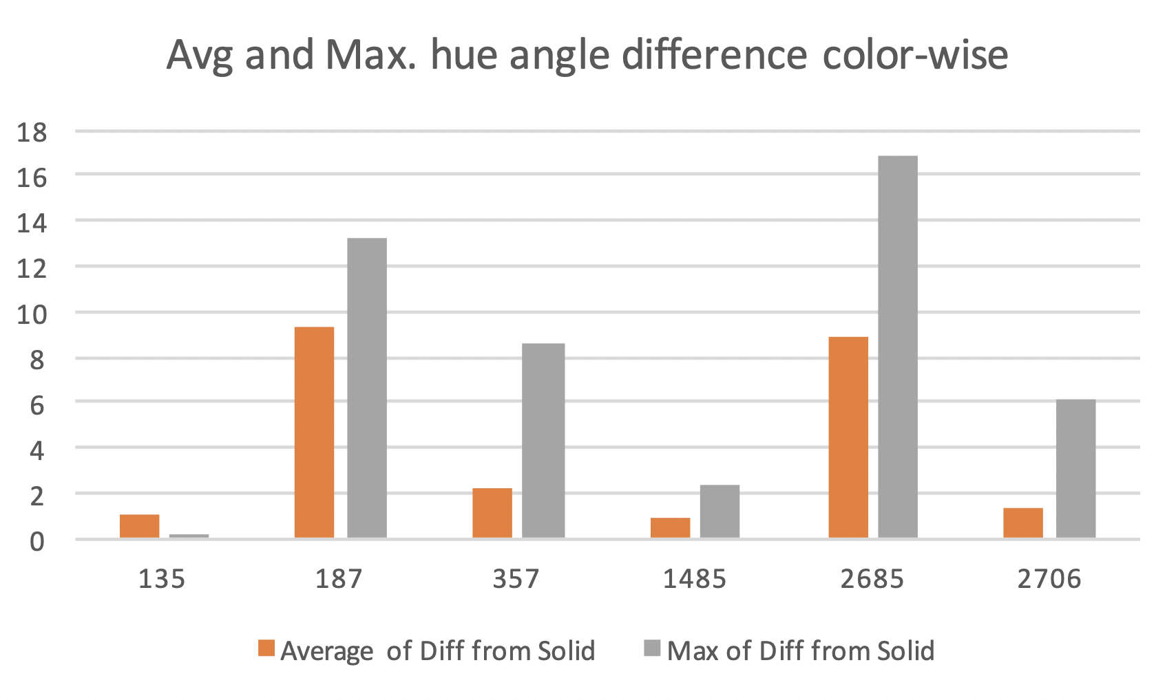
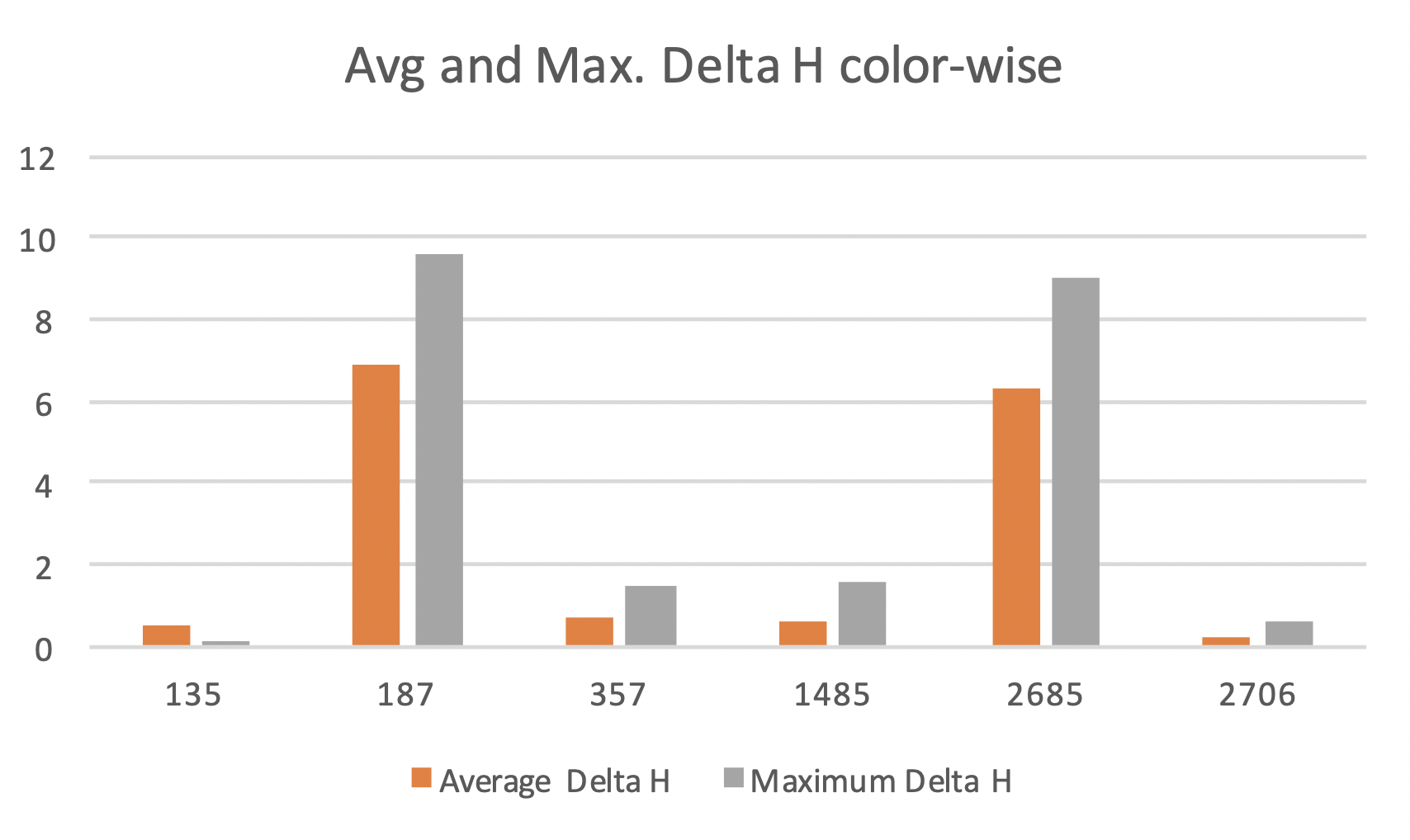
The data suggested that the maximum hue angle difference of more than 10 degrees was observed in the spot color tints for colors Pantone P187 (dark red) and Pantone P2685 (dark violet). The Delta H data agreed with the hue angle difference data with a more distinct differentiation between high and low hue shift colors. The data from this study suggested higher hue shift in darker and more chromatic colors than lighter colors. The highest hue shifts were seen in the red and violet regions. It should be noted that the data from the preliminary study was collected under M1 measurement mode while the all the data collected in the presented study was collected in M0 measurement mode. The preliminary data was only meant to serve as a precursor to the actual study and no direct comparisons were drawn between this data and the data collected under the current study.
PantoneLIVE library provides the colorimetric information for spot color tints in addition to the solids. The top twenty-five most used spot colors from the usage statistics were selected and their colorimetric data, including tints, was extracted from the PantoneLIVE Library. The data were analyzed for hue angle difference. Colors showing a maximum hue angle difference of more than 10 degrees across the tonal range were selected for this study. The PantoneLIVE dependent library - Flexo Water-Based Coated Paper (FWCP) library was used in this study. The colors were also segregated based on their hues and only one color from a segment was selected i.e. one color each from orange, red, purple, blue, and green regions. The following inks were selected for the print trials based on the conditions mentioned above. The maximum hue shift and the corresponding spot color tone value (SCTV) data from PantoneLIVE – FWCP library are also listed below.
|
Color |
Maximum Hue Angle Difference (degrees) |
Spot Color Tone Value at maximum hue angle difference |
|
P357-FWCP (Dark Green) |
19.38 |
17.58 % |
|
P261-FWCP (Purple) |
-19.44 |
18.13 % |
|
POrange021-FWCP (Orange) |
15.17 |
18.01 % |
|
P4975-FWCP (Brown) |
-57.79 |
16.01% |
|
P485-FWCP (Red) |
10.90 |
33.92 % |
|
PReflex Blue-FWCP (Blue) |
9.56 |
24.96 % |
For simplicity reason, the spot colors may be used without the FWCP suffix in this report. The inks were formulated and donated by an ink manufacturer. However, the reflex blue ink was reformulated with the Xrite Ink Formulation Software v6 using an ink recipe suggested by ink company’s color matching experts. The inks viscosity and pH were measured but left unadjusted to avoid any changes in the hue angle due to dilution.
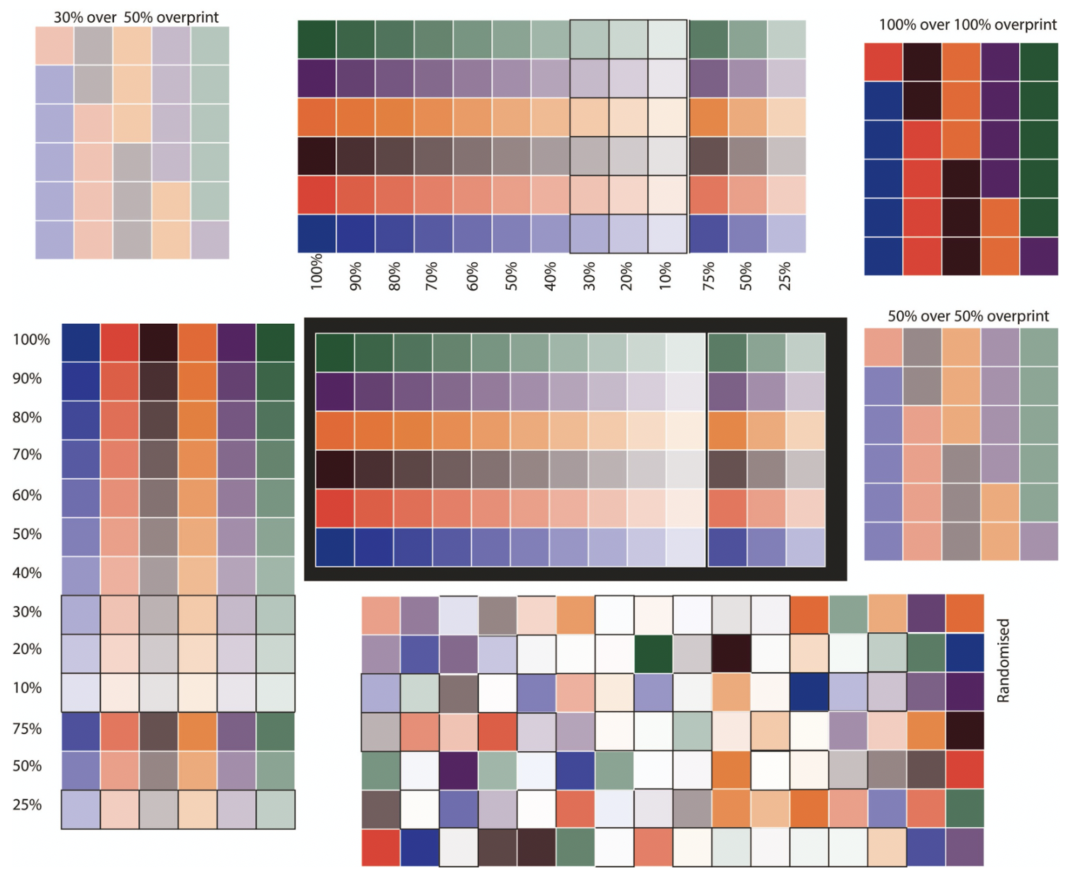
Test Chart
The test chart consisted of tonal patches of the 6 inks arranged along machine direction and cross-direction. A randomized chart with the same patches was also included in the target. The layout of the test chart is as shown below.
Press Setup and Run
The plate files were launched though workflow, arranged and imaged using Esko Automation Engine, Merger and Exposer software. Dupont EPR 067 photopolymeric plates were made on an Esko Crystal Cyrel Digital Imager (CDI) and XPS system. The plates were solvent processed, dried, and post-exposed and light-finished on an Evo 3A machine. The plates were output with a linear curve without any compensation curve applied. However, a 2 to 1 bump curve was applied to the file while launching the workflow. A 120 lpi screening was applied to all the plates and the Esko crystal CDI resolution was set to 4000 dpi. The print trials were conducted on an Omet Varyflex 7 color press at 150 feet-per minute (fpm). The first station was used for printing black and the rest six stations were used to print six different spot color inks. The impression settings were set at minimum impression. The ink sequence and the anilox used for each station are listed in Table 3.
|
Station No. |
Ink |
Anilox Configuration |
|
1 |
Process Black |
500 lpi/5.0 bcm |
|
2 |
Pantone 357 |
900 lpi /2.2 bcm |
|
3 |
Orange 021 |
800 lpi/2.8 bcm |
|
4 |
Pantone 261 |
600 lpi /4.0 bcm |
|
5 |
Pantone Reflex Blue |
500 lpi /4.0 bcm |
|
6 |
Pantone 485 |
800 lpi /2.8 bcm |
|
7 |
Pantone 4975 |
900 lpi /2.2 bcm |
The Delta E00 tolerance was set at 5.00 due to anilox availability limitation and inks being formulated to a standard ink film thickness. However, the Delta H tolerance was kept under 2.5 for all colors. Xrite-Colorcert software was used for achieving and monitoring color on the press. The standard and the measured print results during setup are mentioned in Table 4.
|
Color |
Standard |
Print Result |
Deltas |
|
P357- FWCP |
L: 33.96 a: -23.08 b: 13.06 C: 26.52 h: 150.50 |
L: 32.72 a: -24.11 b: 13.22 C: 27.50 h: 151.26 |
L: -1.24 a: -1.03 b: 0.16 E00=4.2 C: 0.98 h: 0.76 |
|
P261 - FWCP |
L: 26.53 a: 31.83 b: -22.33 C: 38.88 h: 324.95 |
L: 21.39 a: 26.77 b: -17.51 C: 31.99 h: 326.81 |
L: -5.14 a: -5.06 b: 4.82 E00=4.63 C: -6.89 h: 1.86 |
|
POrange 021 - FWCP |
L: 62.71 a: 57.65 B: 73.79 C: 93.64 h: 52 |
L: 64.96 a: 53.30 b: 74.09 C: 91.27 h: 54.27 |
L: 2.26 a: -4.35 b: 0.30 E00=2.75 C: -2.37 h: 2.27 |
|
P485 - FWCP |
L: 50.43 a: 61.13 b: 47.18 C: 77.22 h: 37.66 |
L: 47.85 a: 66.33 b: 48.54 C: 82.19 h: 36.20 |
L: -2.59 a: 5.20 b: 1.37 E00=3 C: 4.98 h: -1.46 |
|
PReflex Blue - FWCP |
L: 24.01 a: 30.22 b: -62.47 C: 69.40 h: 295.81 |
L: 20.91 a: 29.81 b: -66.06 C: 72.48 h: 294.29 |
L: -3.1 a: -0.41 b: -3.59 E00=2.86 C: 3.08 h: -1.52 |
|
P4975-FWCP – Recipe 1 |
L: 20.07 a: 6.94 b: 3.19 C: 7.64 h: 24.69 |
L: 20.01 a: 14.14 b: 6.69 C: 15.64 H: 25.32 |
L: -0.06 a: 7.19 b: 3.50 E00= 6.42 C: 8.00 h: 0.66 |
|
P4975-FWCP – Recipe 2 |
L: 20.07 a: 6.94 b: 3.19 C: 7.64 h: 24.69 |
L: 23.27 a: 5.62 b: 2.59 C: 6.19 H: 24.77 |
L: 3.20 a: -1.32 b: -0.60 E00= 2.67 C: -1.45 h: 0.08 |
Data Collection
Fifteen sheets were randomly selected from the printed roll and measured. The measurements were taken with an Xrite eXact Standard + Scan instrument using the Xrite DataMeasure tool. Measurements were taken in M0 mode as the PantoneLIVE data was available in M0 mode. The measured tristumuls values and L*a*b* values were used to calculate SCTV, and chroma and hue values. The data from printed sheets were averaged over fifteen sheets for each color. The average hue angle and hue shifts of fifteen sheets per color were used for drawing graphs and corresponding inferences. The measurements for patches under 15% SCTV were disregarded as these showed abnormally high hue shifts. This can be attributed to the proximity to the achromatic axis and significant show-through effect from the paper.
Results and Discussion
The hue angle difference, Delta H and orthogonal distance were plotted against the measured SCTV value for all the printed colors. The curve shapes for each metric were compared between the digital reference (PantoneLIVE data) and the print output. The extent of difference between maximum hue shift for print and maximum hue shift for PantoneLIVE were used to judge the similarity. Moreover, the maximum hue shift shown in the print and PantoneLIVE data should be in the similar tonal range (either both in highlight, midtone or shadows) for the curves to be termed similar. The plotted curves were also examined for the trends in hue shift and the tonal areas most susceptible to hue shift. The maximum hue shift was also noted and compared between the tested colors.
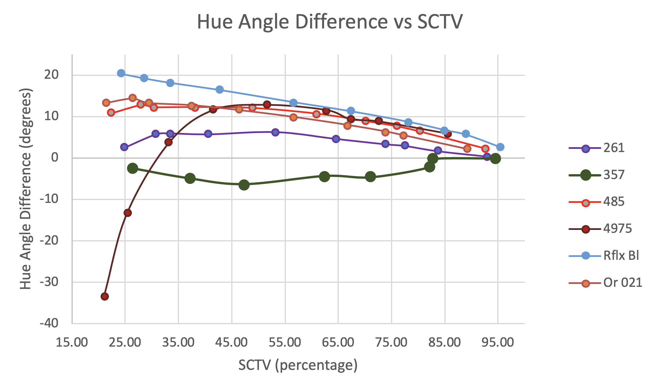
Figure 7 shows the hue angle difference in the measured printed samples. The general trend suggested an increase in hue angle difference as the measured SCTV decreased. P261 and P357 showed maximum hue shifts below 10 degrees between 30% and 50% SCTV. The most significant hue shift was seen in P4975. This was followed by PReflex Blue, POrange 021 and P485. P4975 distinctively stood out from this image. This color showed a high negative hue angle difference which changed to positive at approximately 30% SCTV and above. This was due to the low chromaticity of the color and proximity to the achromatic axis. Even small changes in a* and b* values can show high hue shifts near the achromatic axis.
An overview of Delta H is presented in Figure 8. Unlike the hue angle difference graph, a clear distinction can be seen between two sets of colors. While some colors showed Delta H close to 0 throughout the tonal range, few colors showed Delta H around 10 in the midtone region. The curve shape for Delta H was also different than the curve shape for hue angle difference. An increase in Delta H can be seen as the SCTV approaches midtone from either end of the tone-scale. The colors showing a low maximum Delta H, between 3 and -3, are P261, P357, P4975-1C (P4975 printed with ink recipe 1) and P4975-2 (P4975 printed with ink recipe 2). The color P4975 showed low Delta H despite showing a high hue angle difference. This was due to the chromaticity scaling incorporated in the Delta H calculation. Since, the chromaticity of P4975 was low, the Delta H value was scaled down. The colors P485, PReflex Blue and POrange021 showed maximum Delta H of more than 10. The curve for these colors have a characteristic shape where the highest Delta H is seen in the midtones.
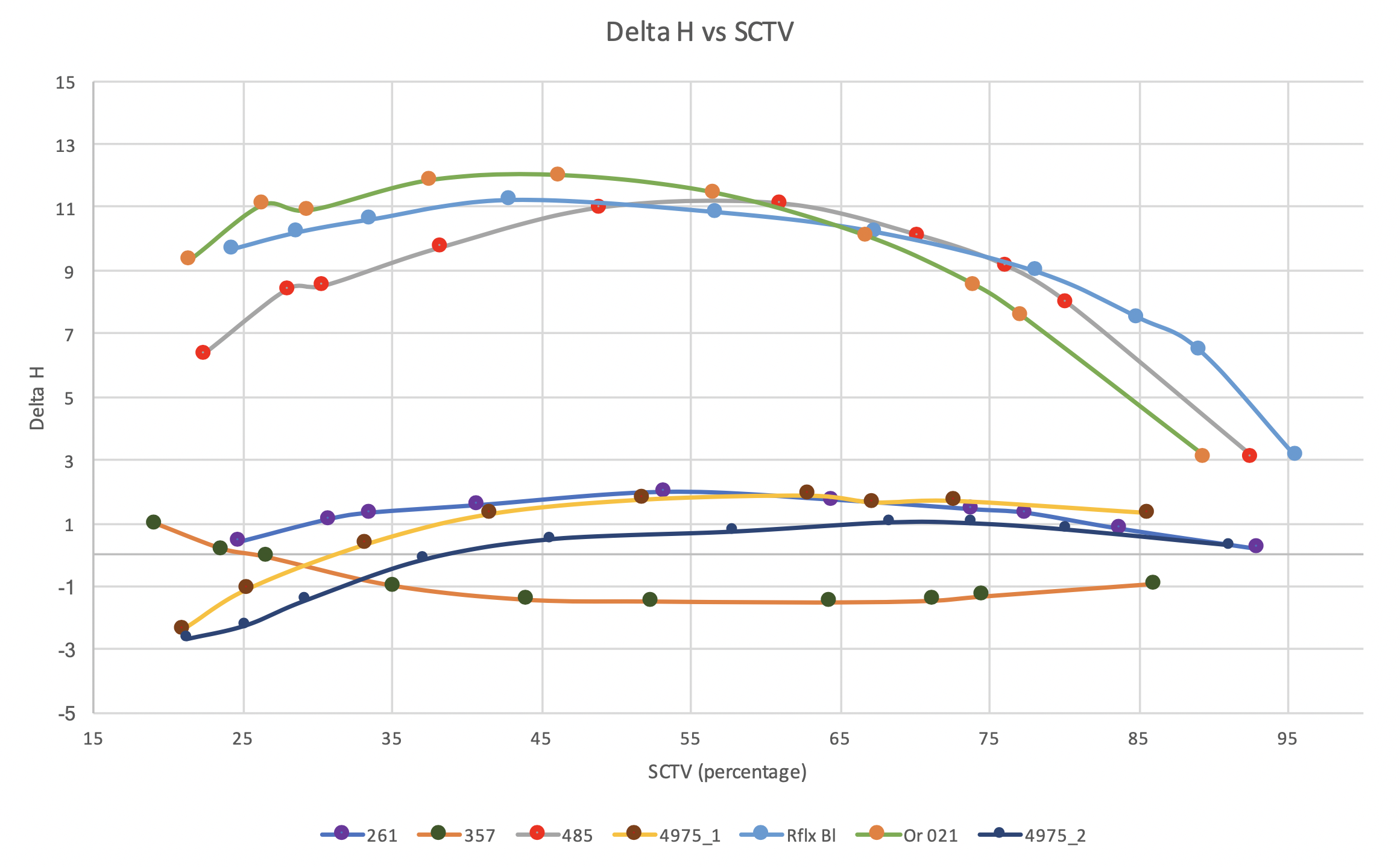
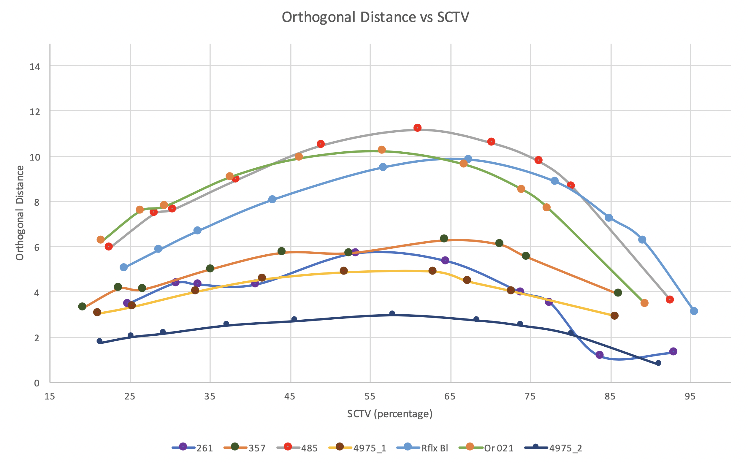
Figure 9 presents the orthogonal distance results in graphical form. While the colors P261, P357, P4975-1 and P4975-2 showed low orthogonal distances, the colors P485, PReflex Blue and POrange021 showed maximum orthogonal distance above 10. The curve shape resembled that of Delta H where the orthogonal distance increases and showed peak in the midtones.
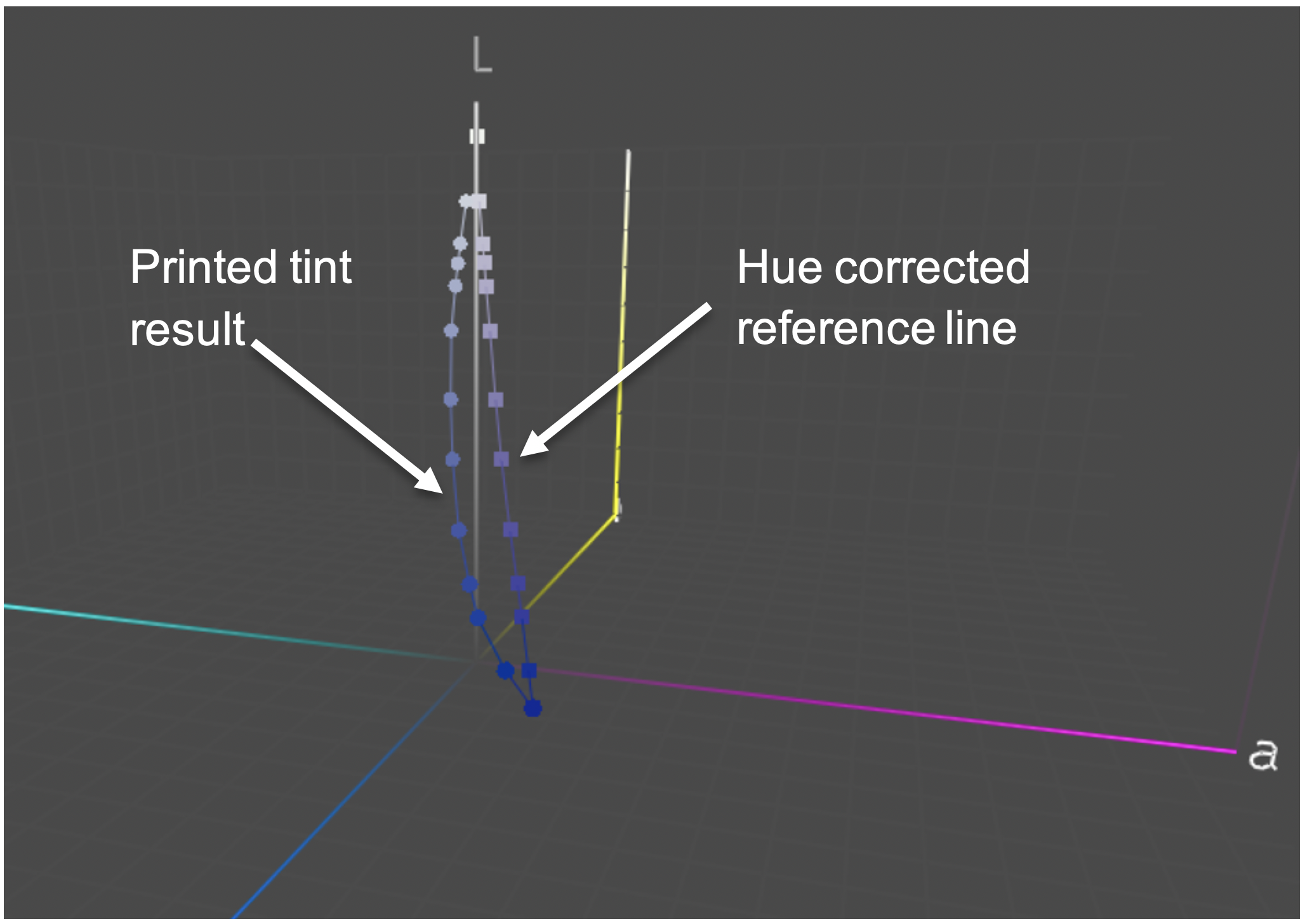
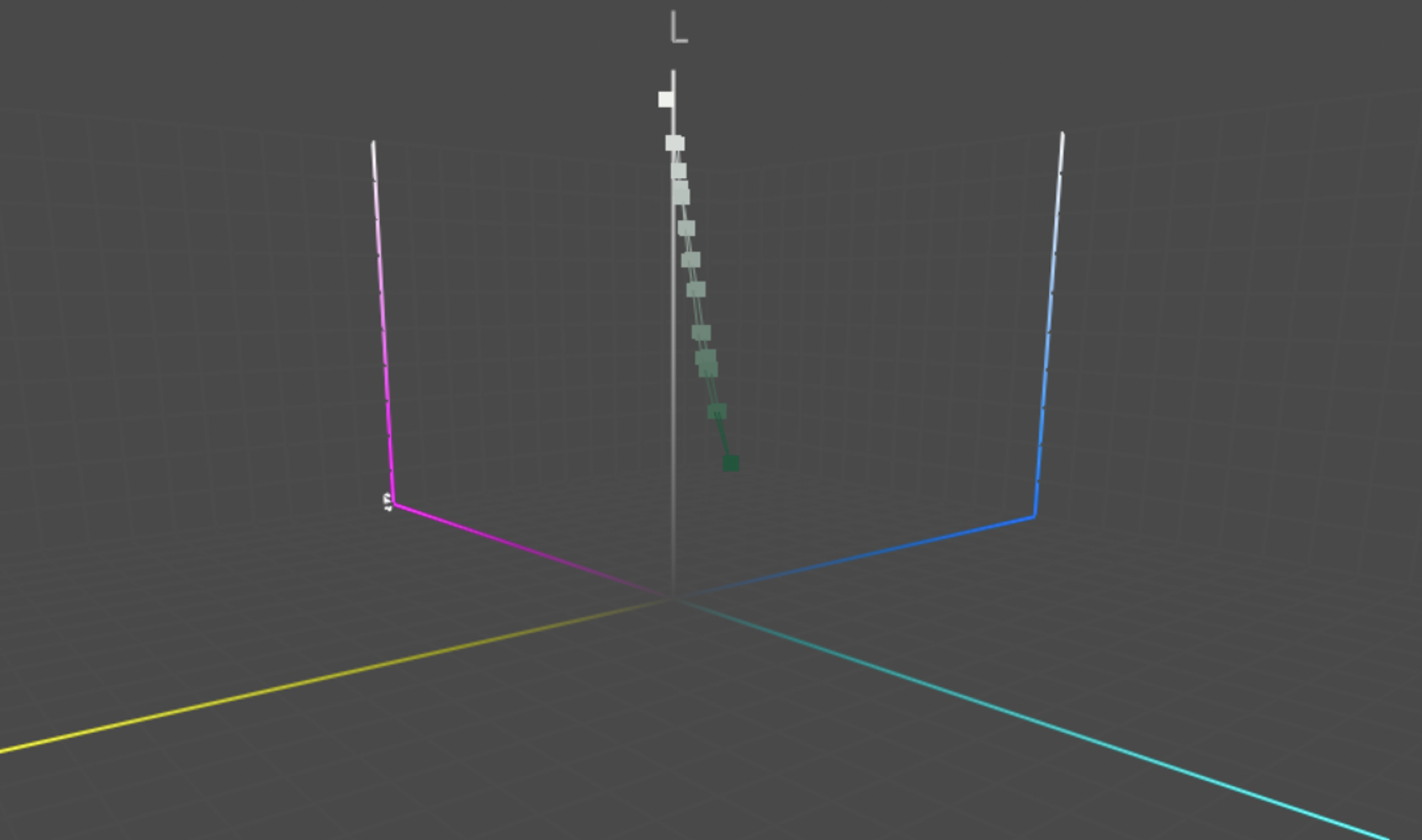
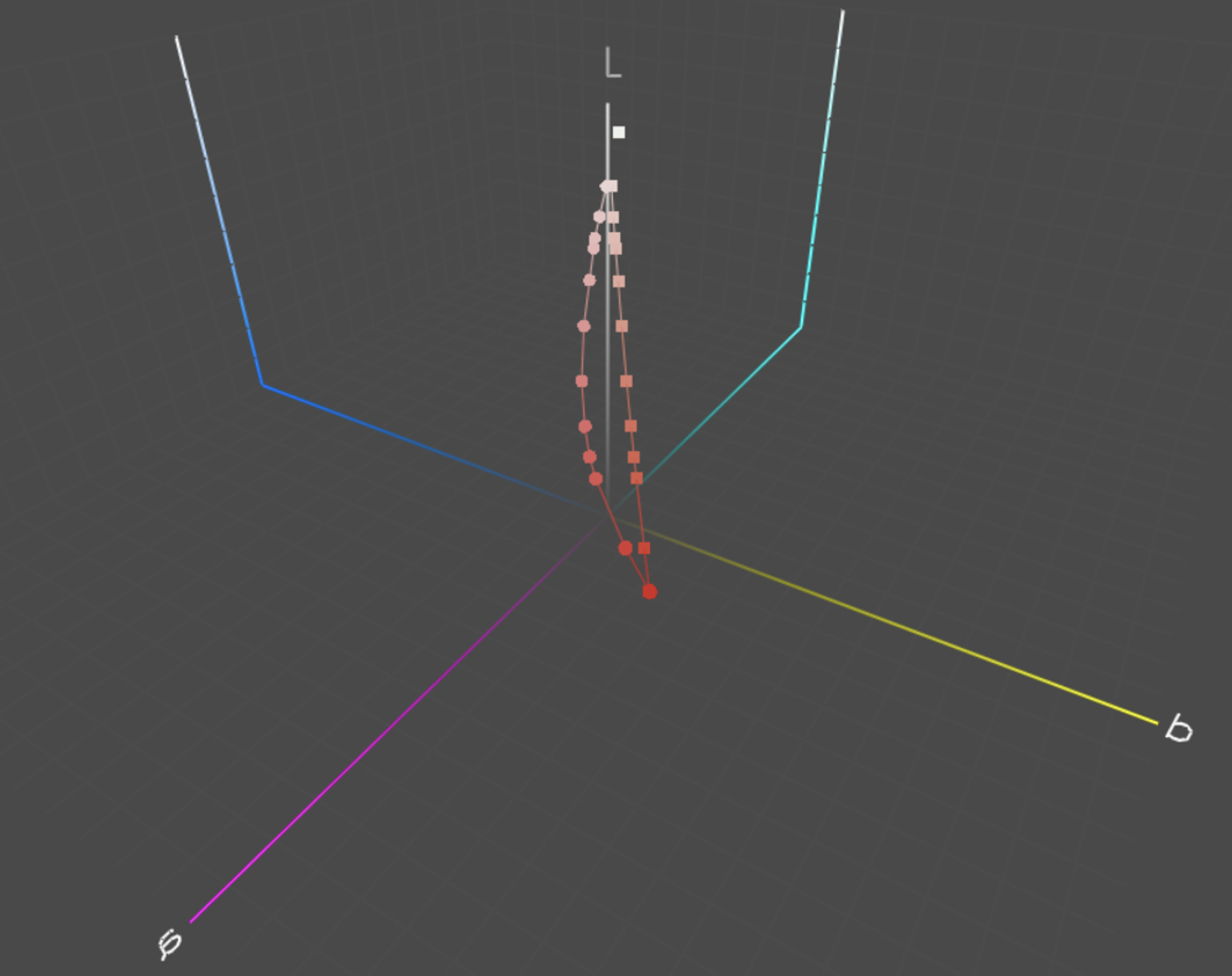
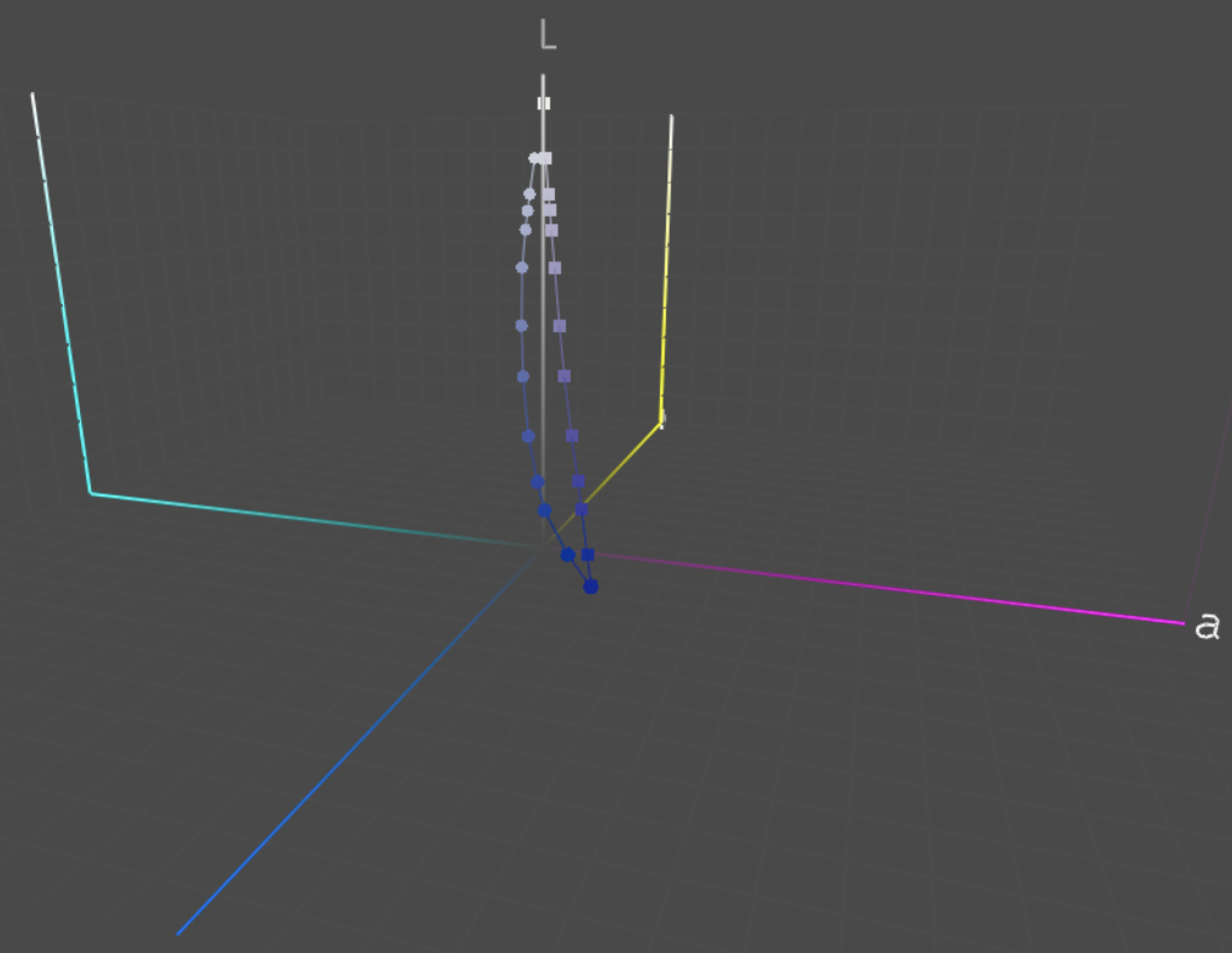
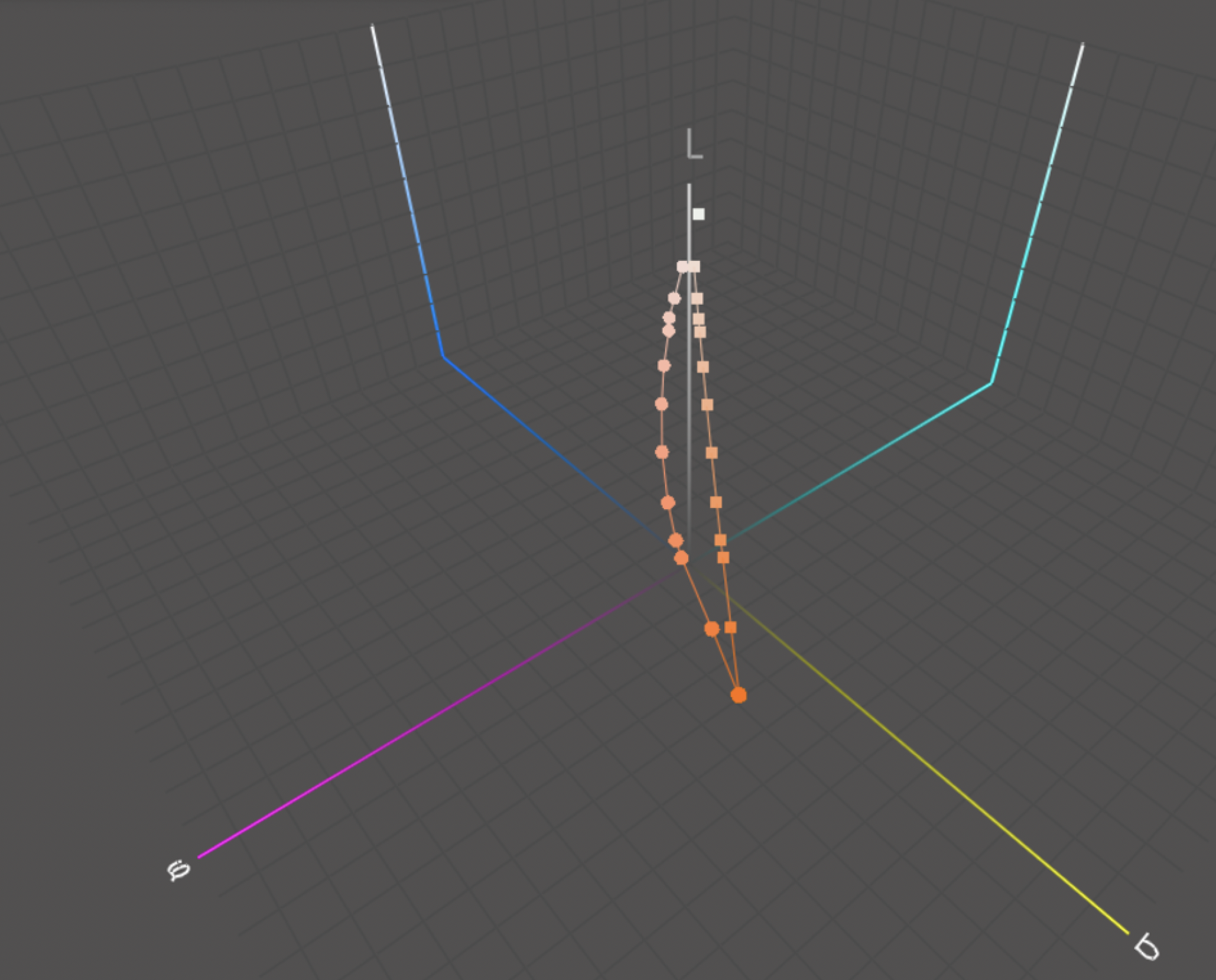
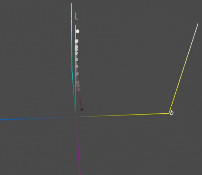
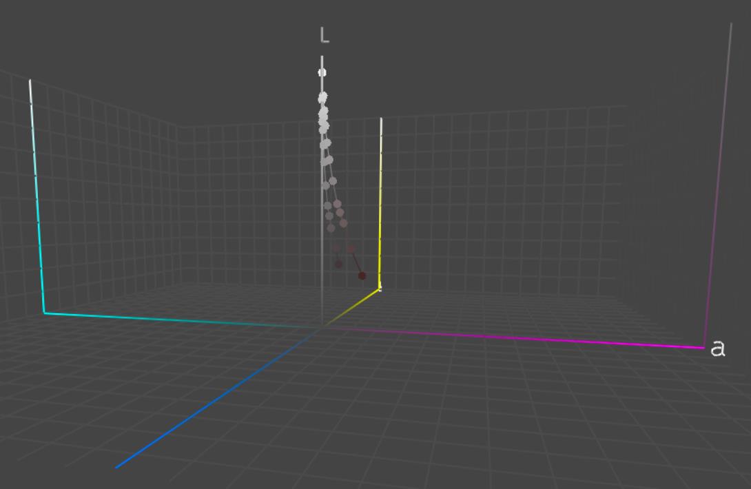
The hue angle difference, Delta H and orthogonal distance results are presented and discussed for each color below. The L*a*b* values from the print measurements were plotted in CIELAB color space using ColorThinkPro v3.0.7. Another series was added to the ColorThink plots as the hue corrected series. The hue corrected series contains the same L*C* values as the printed tints, but the hue angle was kept the same as the solid. This series was used to serve as a reference to visually highlight the hue shift seen in the printed results. The print data series can be identified by spherical shaped points while the hue corrected data series is represented by cube shaped data points (Refer Fig. 2 for labelled figure).
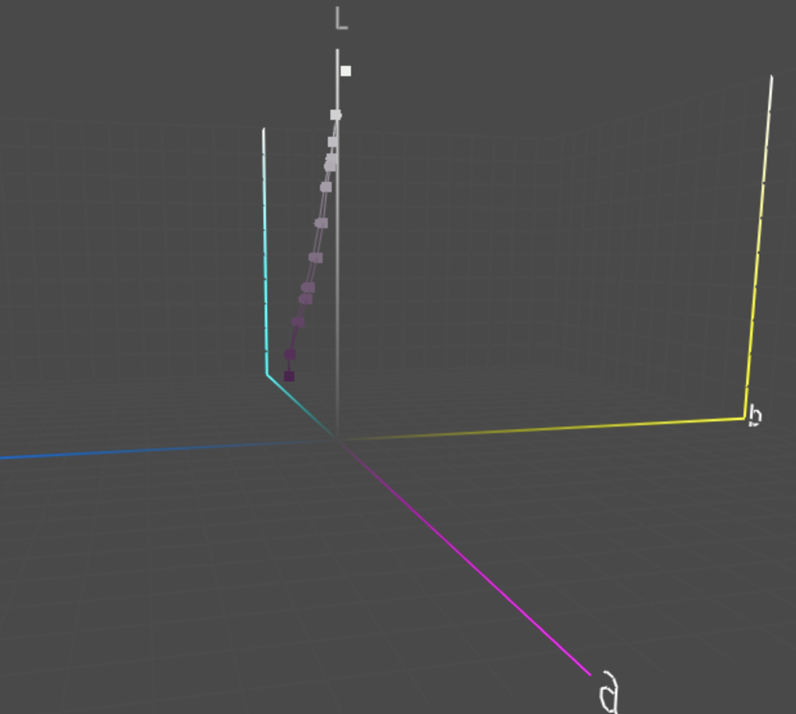
The print and hue corrected lines for P261-FWCP data did not show a noticeable hue shift.
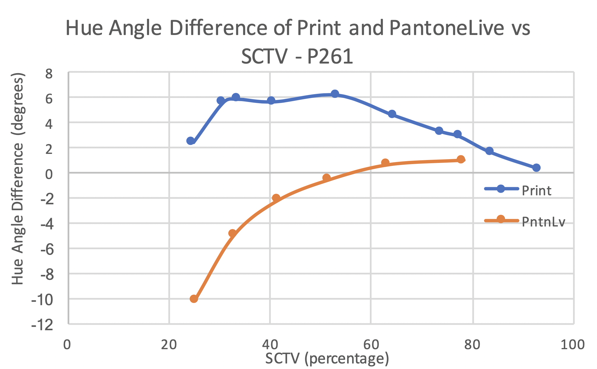
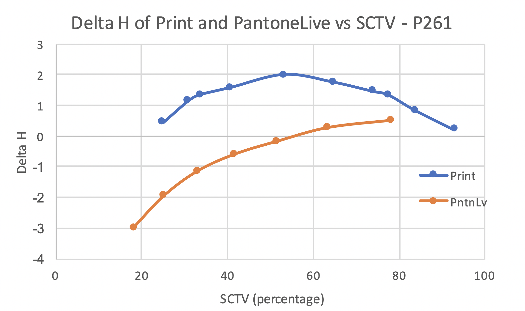
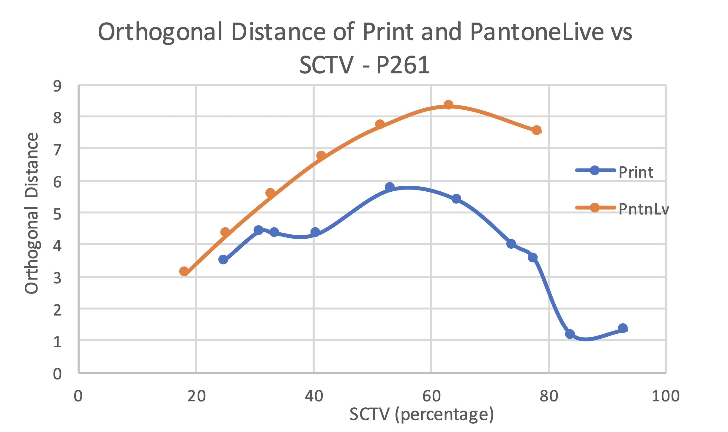
The maximum hue angle difference for P261 – Print was approximately 6 degrees while for PantoneLIVE data, the maximum was around -10 degrees. The nature of hue angle difference and Delta H predicted by the PantoneLIVE data is not very well replicated in the print. The PantoneLIVE data shows the hue angle difference and Delta H to be increasing with decrease in SCTV. On the other hand, the print data reaches maximum hue angle difference and Delta H at 50% SCTV and reduces as the SCTV increases or decreases from there. This behavior was more distinctly seen with Delta H metric than the hue angle difference. While the curve for print showed a positive shift, the PantoneLIVE data curve suggested a negative hue angle difference and Delta H below 50% SCTV. The curve shape for PantoneLIVE data showed an almost linear increase in Delta H as the SCTV reduced. The orthogonal distance showed the same curve shape for print as hue angle difference and Delta H with maximum distance at 50%. The curve shape for the PantoneLIVE data also agreed with the other metrics, except that a peak was seen at around 65% SCTV. The orthogonal distance curve from print was similar to the PantoneLIVE curve.
The print and hue corrected lines for P357-FWCP data did not show any noticeable hue shift.
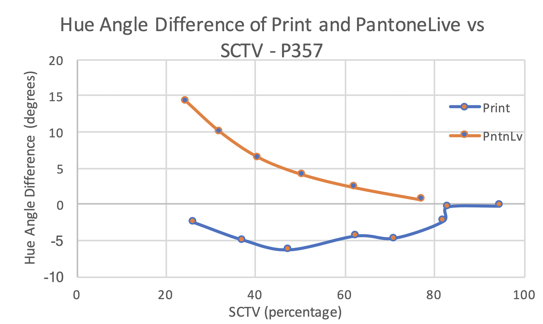
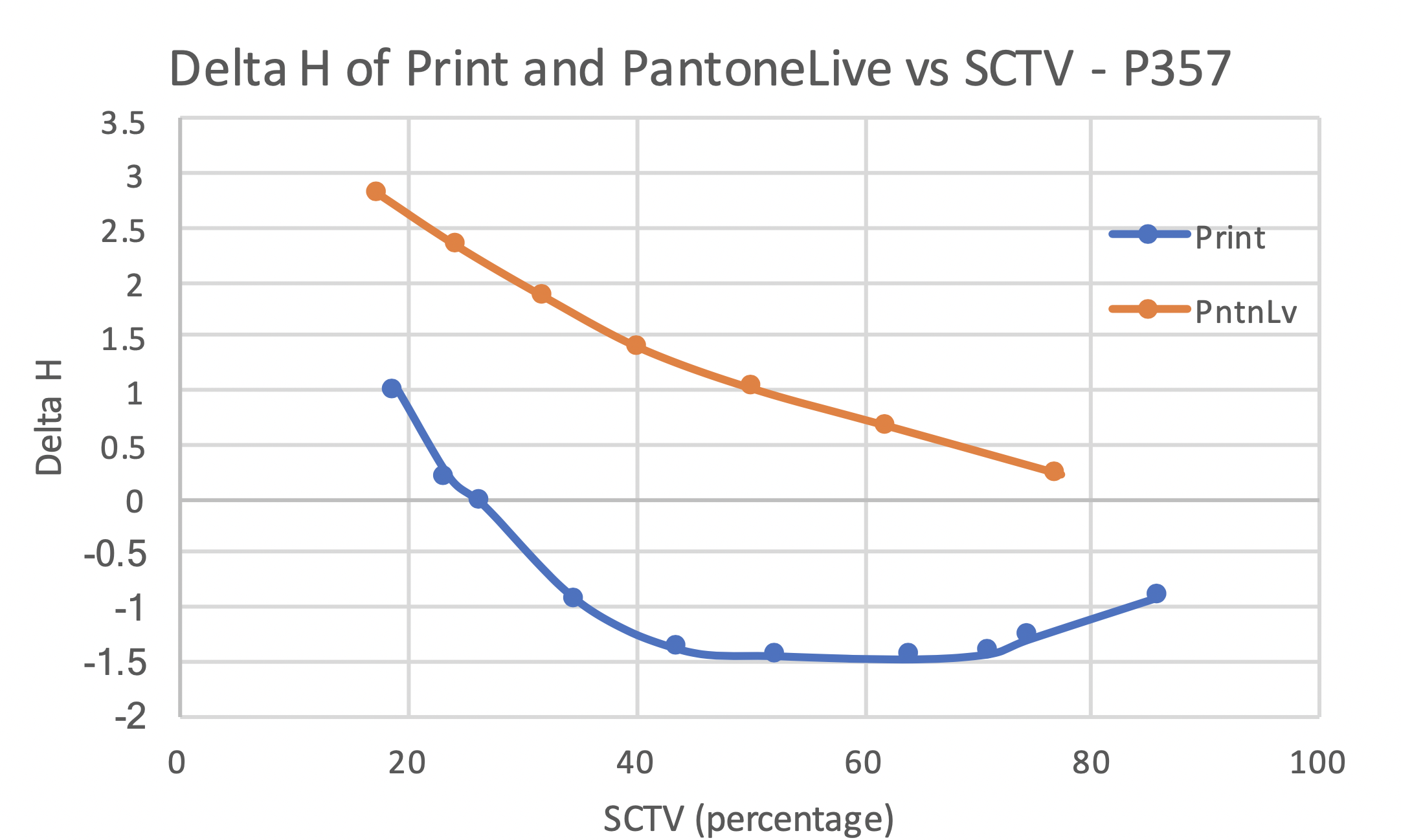
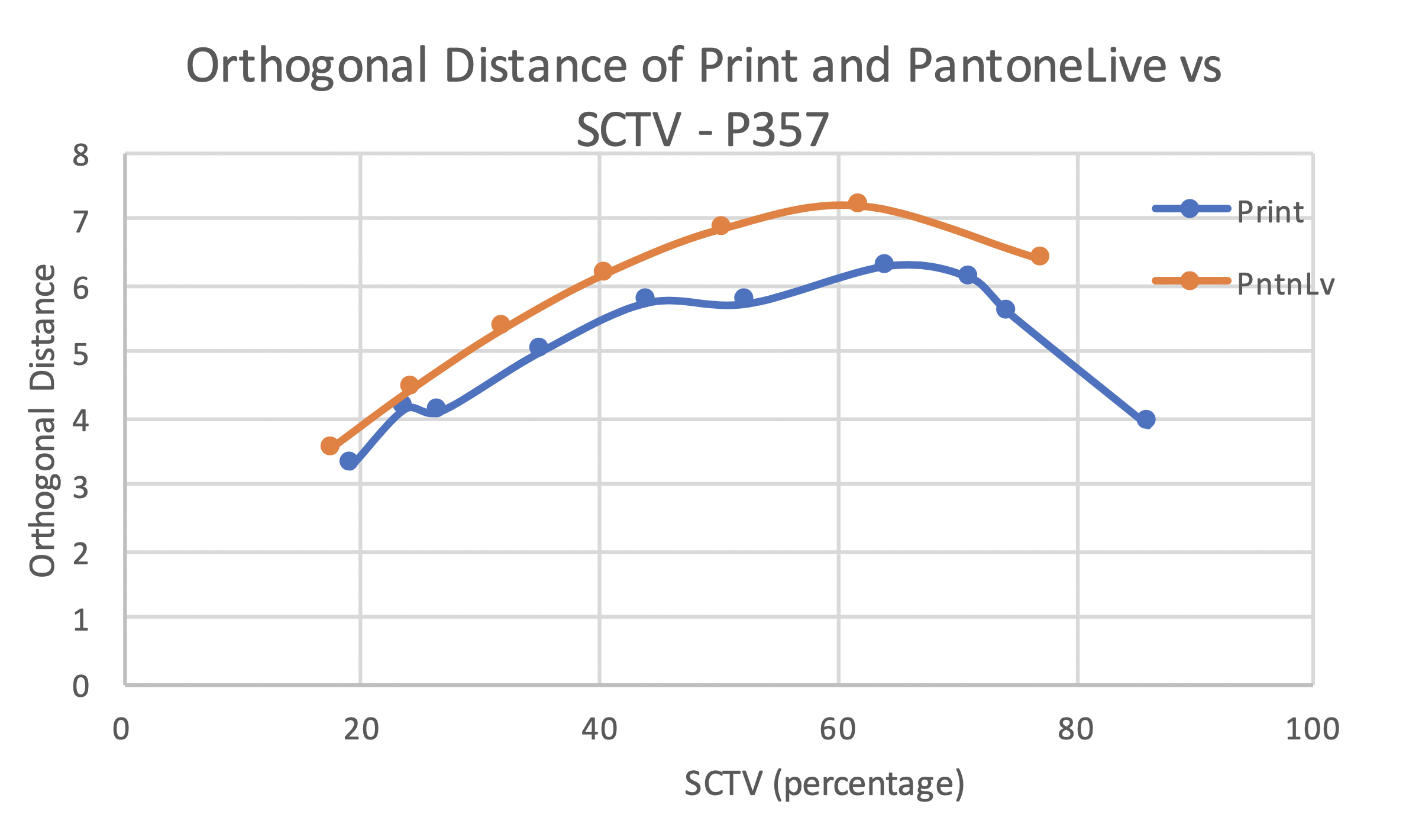
The observed hue angle difference and Delta H in print was significantly lesser than the PantoneLIVE predictions. While the maximum hue angle difference and Delta H were observed around 50% SCTV in print, the maximums were observed around 25% SCTV for PantoneLIVE data. The hue angle difference and Delta H curve shapes were different for print and PantoneLIVE. The PantoneLIVE data showed an increase in these metrics as SCTV reduced, while the print data showed a maximum at around 50% SCTV and reduced on either side of the tone scale. Moreover, the PantoneLIVE data showed positive hue angle difference and Delta H, while the print data showed hue angle difference and Delta H in the opposite direction. Unlike the other metrics, the orthogonal distance curves for print and PantoneLIVE appeared similar. The maximum orthogonal distance was observed between 60% and 65% SCTV for both, print and PantoneLIVE.
The print and hue corrected lines for P485-FWCP data showed a noticeable hue shift. The hue shift curve suggested highest hue shift in the midtone region with decreasing shift towards highlights and solids.
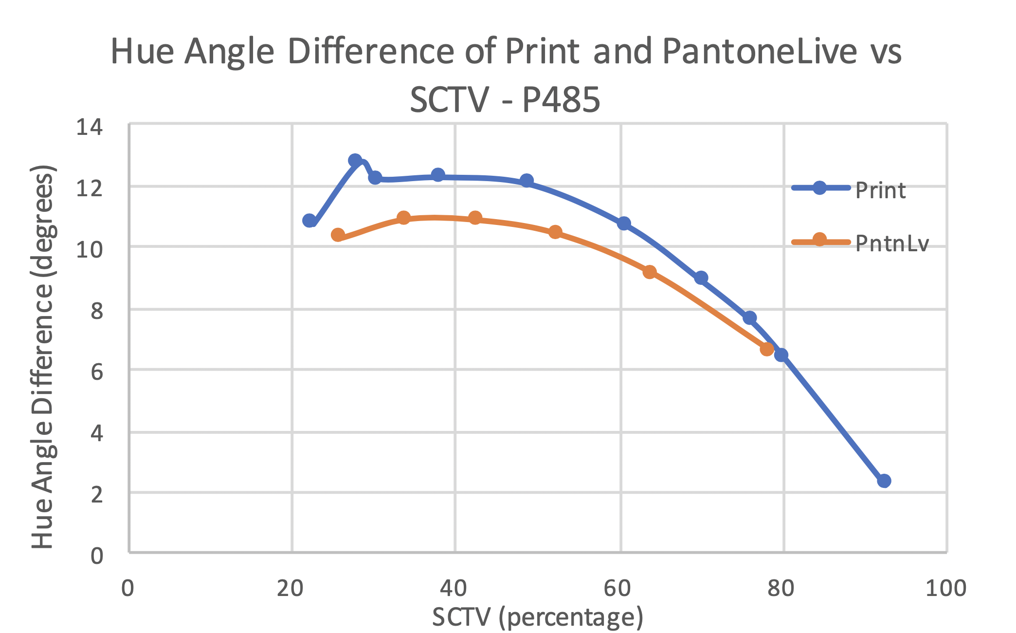
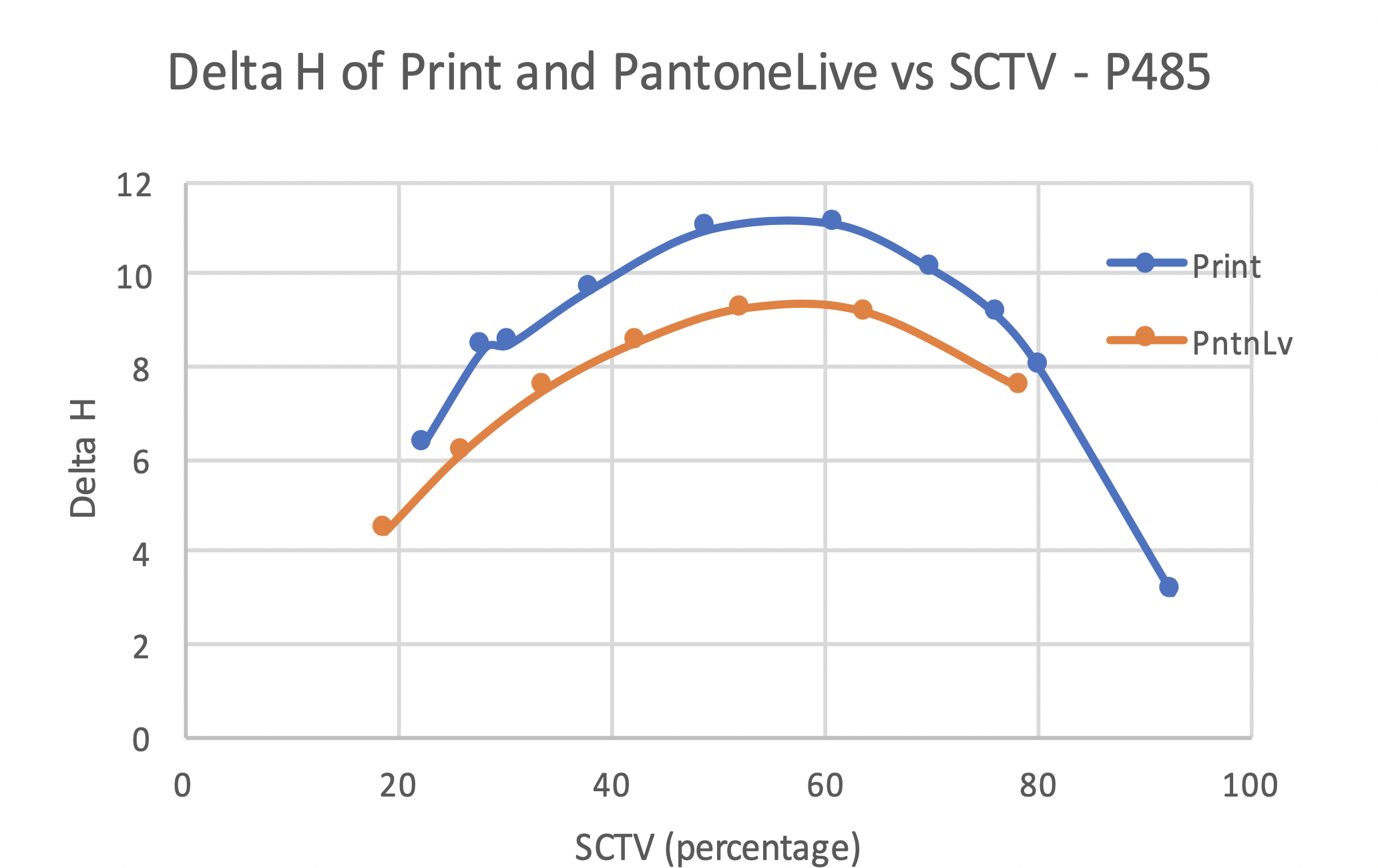
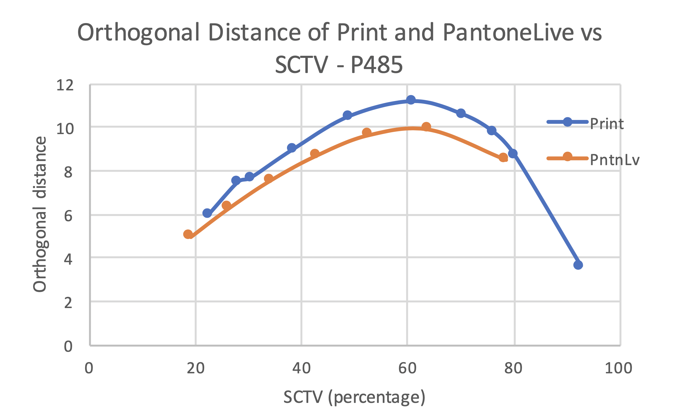
The hue angle difference for print and PantoneLIVE showed similar curve shape and amplitude of shift. The hue angle difference curves went through peak between 30 and 40%. The Delta H curves for print and PantoneLIVE data showed peaks at around 55%. A good approximation of print was seen with the PantoneLIVE data in terms of curve shape and extent of Delta H and orthogonal distance. The maximum hue angle difference was higher than 10 degrees for print and PantoneLIVE data of P485 – FWCP. The orthogonal distance curves for print and PantoneLIVE also appeared similar with the peak on both curves between 60 and 65% SCTV.
The print and hue corrected curves for PReflex Blue-FWCP data showed a noticeable hue shift. The hue shift curve suggested highest hue shift in the midtone region with decreasing shift towards highlights and solids.
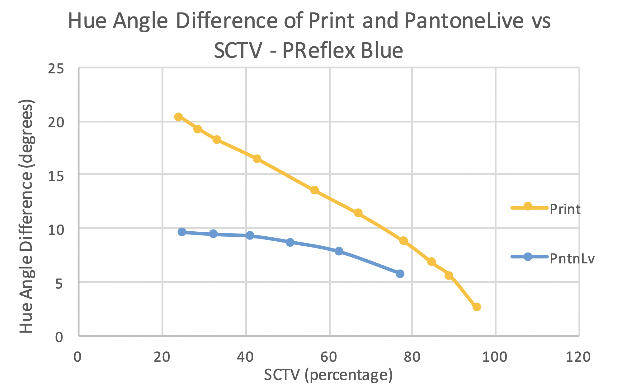
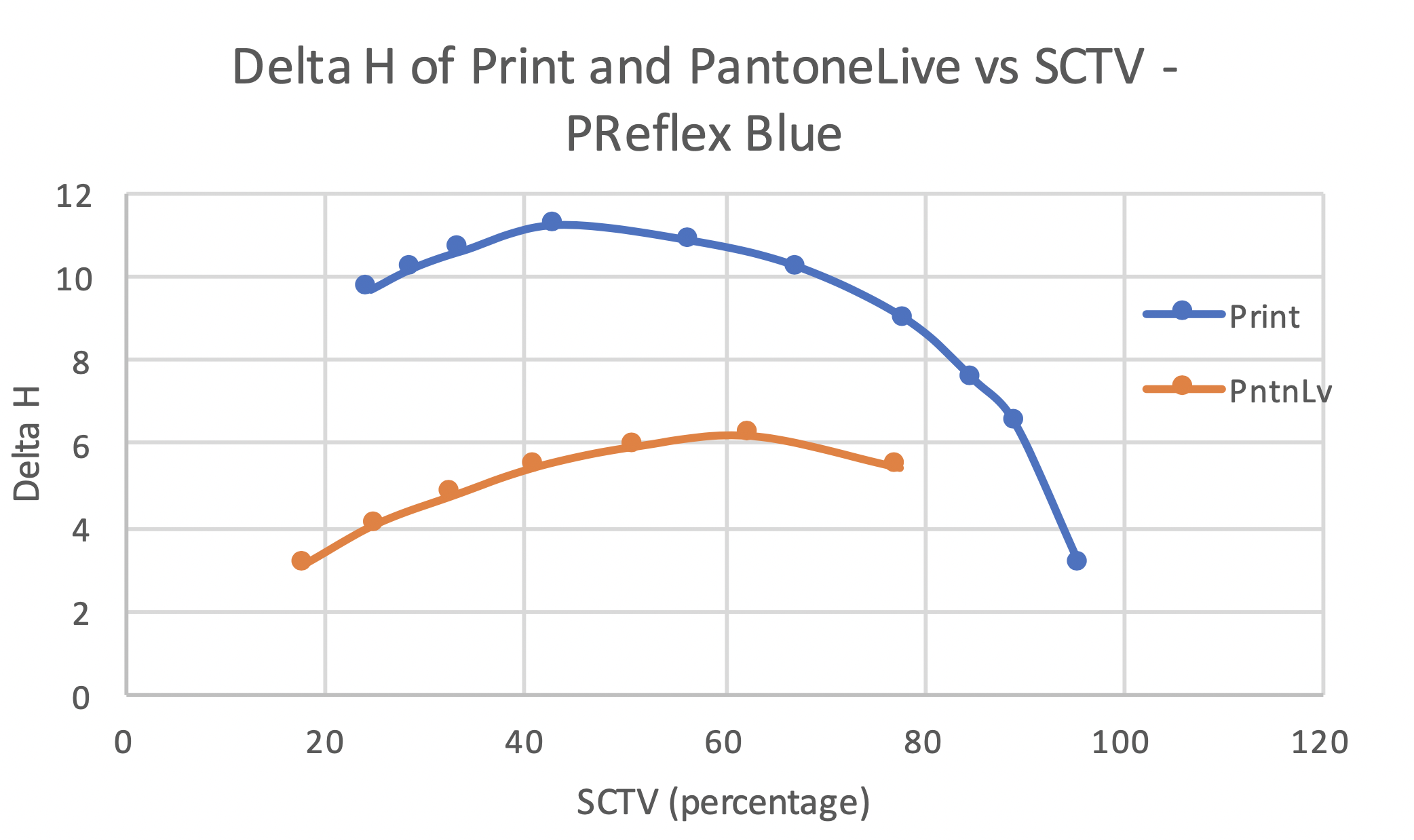
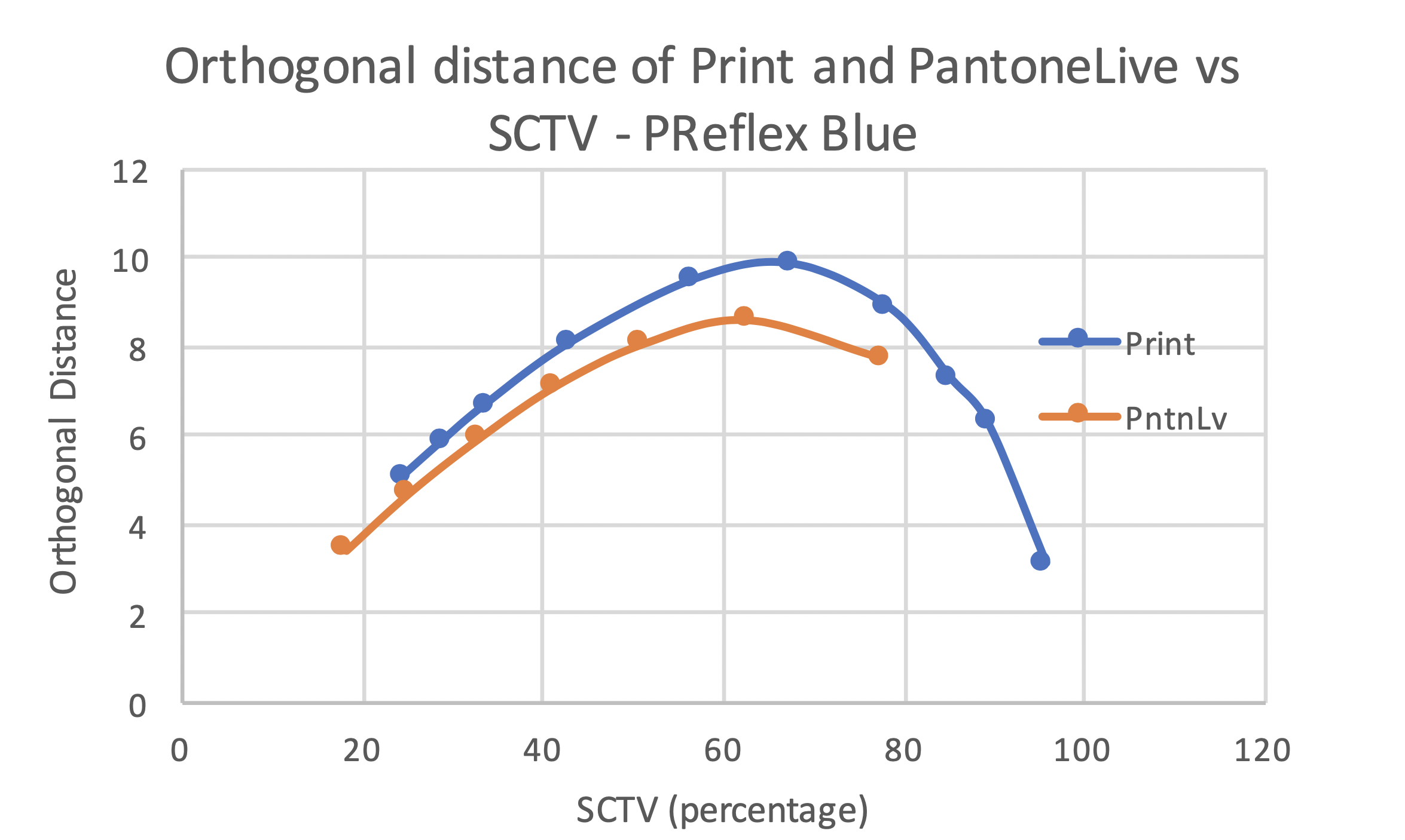
The hue angle difference for print and PantoneLIVE data of PReflex Blue showed similar curve shapes but a large difference in extent of hue shift. The curve trend suggested an increase in hue angle difference as SCTV reduced. This increase was more pronounced in print data when compared to PantoneLIVE data. The maximum hue angle difference for both the data was observed at around 22% SCTV. The Delta H curve shapes were different for the print and PantoneLIVE data. While the print data showed peak in the highlights, the PantoneLIVE data suggested maximum Delta H in the midtone region. A decrease in Delta H was observed as the SCTV moved in either direction from these peaks. The orthogonal distance data for Print and PantoneLIVE data showed similar curve shapes . The orthogonal distance curve shape suggested a peak in the midtone region and a decrease as the SCTV moved in either direction.
The print and hue corrected curves for POrange021-FWCP data showed a noticeable hue shift. The hue shift curve suggested highest hue shift in the midtone region with decreasing shift towards highlights and solids.
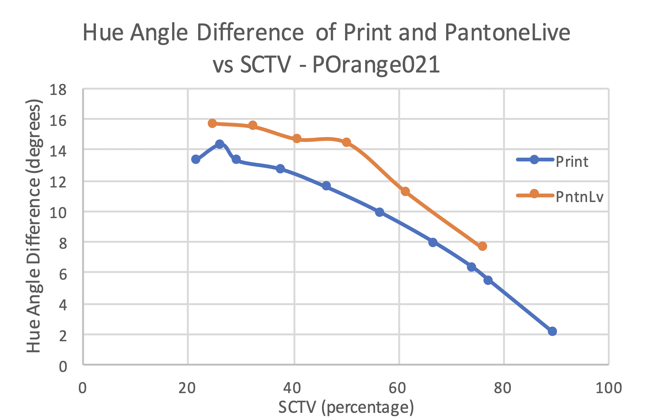
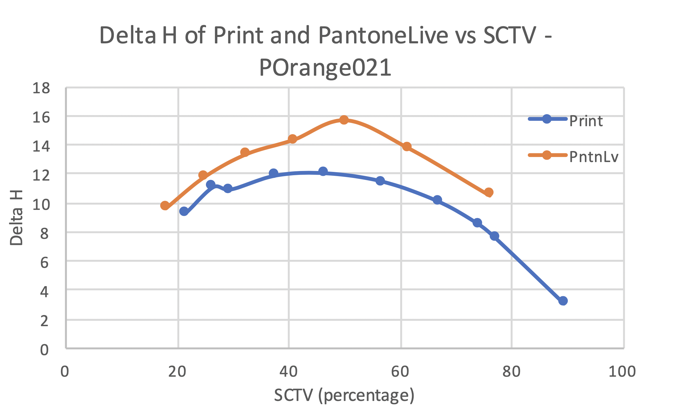
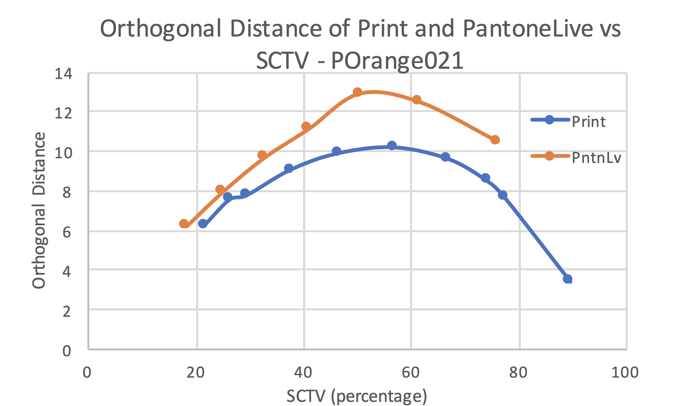
The hue angle difference, Delta H and the orthogonal distance curves for print and PantoneLIVE data of POrange 021 showed similar shape and extent of shift. The trend suggested an increase in hue angle difference as the SCTV reduced. The hue shifts predicted by PantoneLIVE data were slightly higher than that observed in the printed samples. Unlike the hue angle difference data, the peak Delta H and orthogonal distance for print and PantoneLIVE data were observed between 40% and 60% SCTV. The metrics showed a decrease as the SCTV moved above or below that range. Overall, the PantoneLIVE data predicted the print hue shift performance well for this color.
The print and hue corrected lines for both recipes of P4975-FWCP data did not show a noticeable hue shift in CIELAB plot. On comparing the two recipes with each other, a similar hue shift behavior was observed between them.
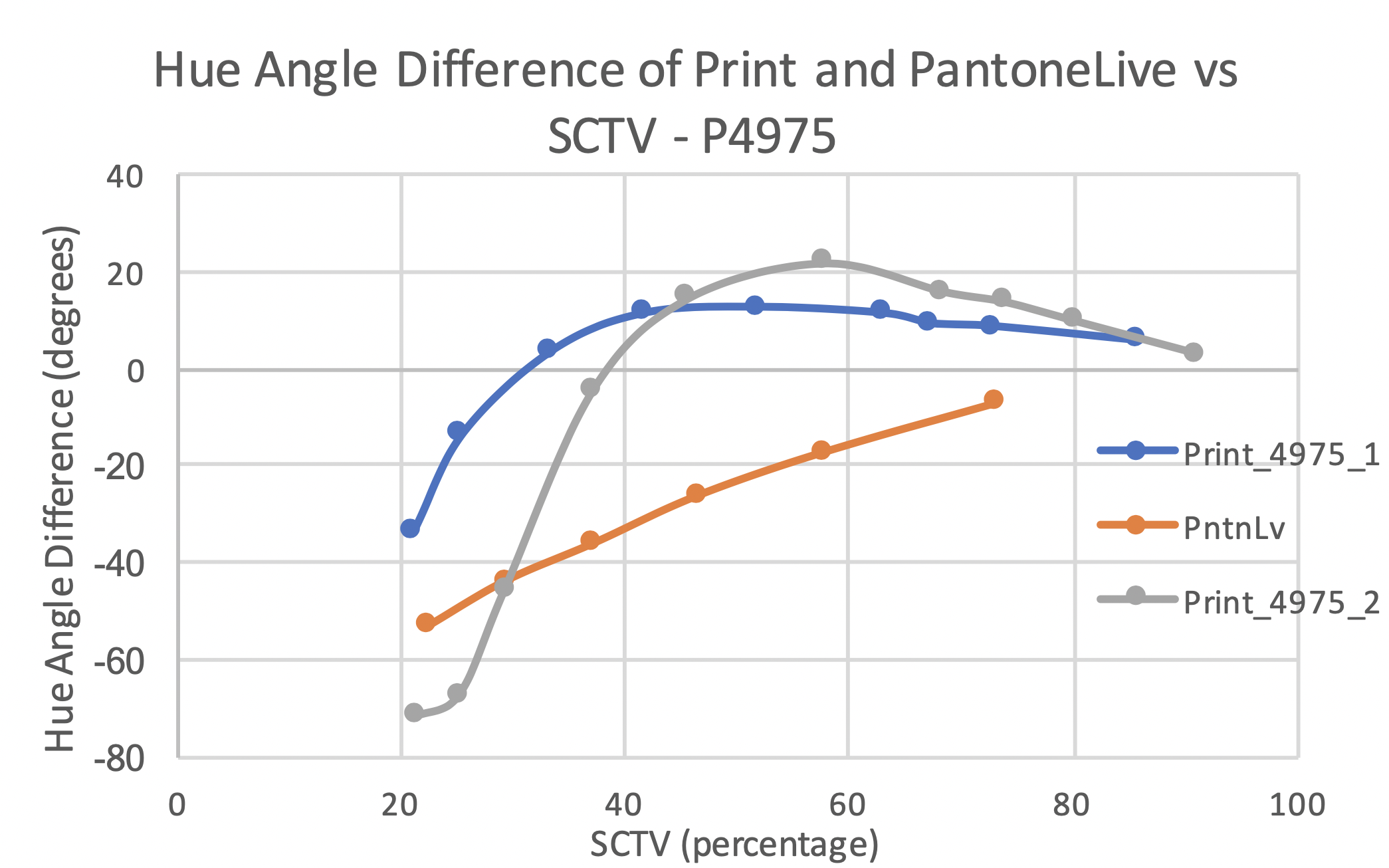
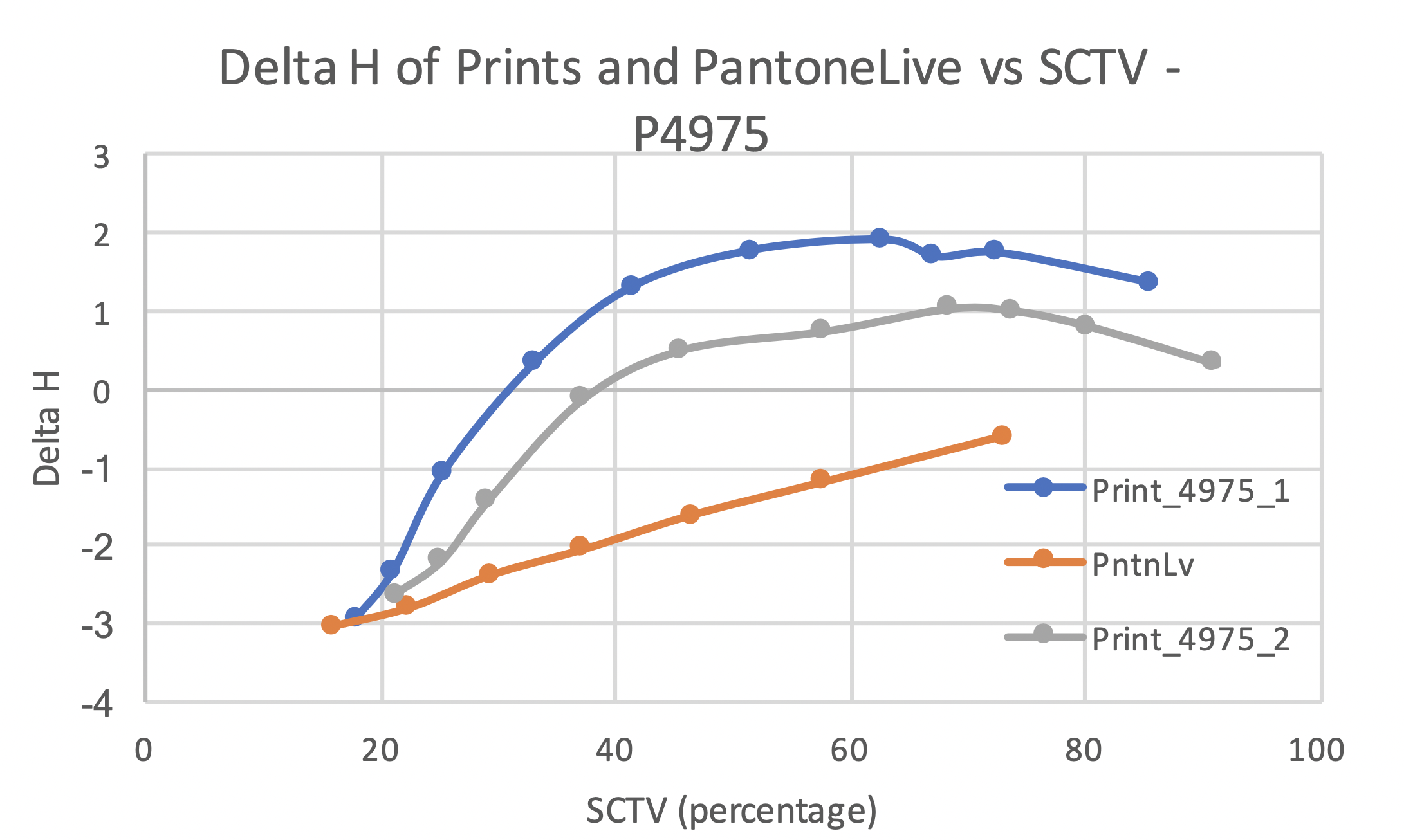
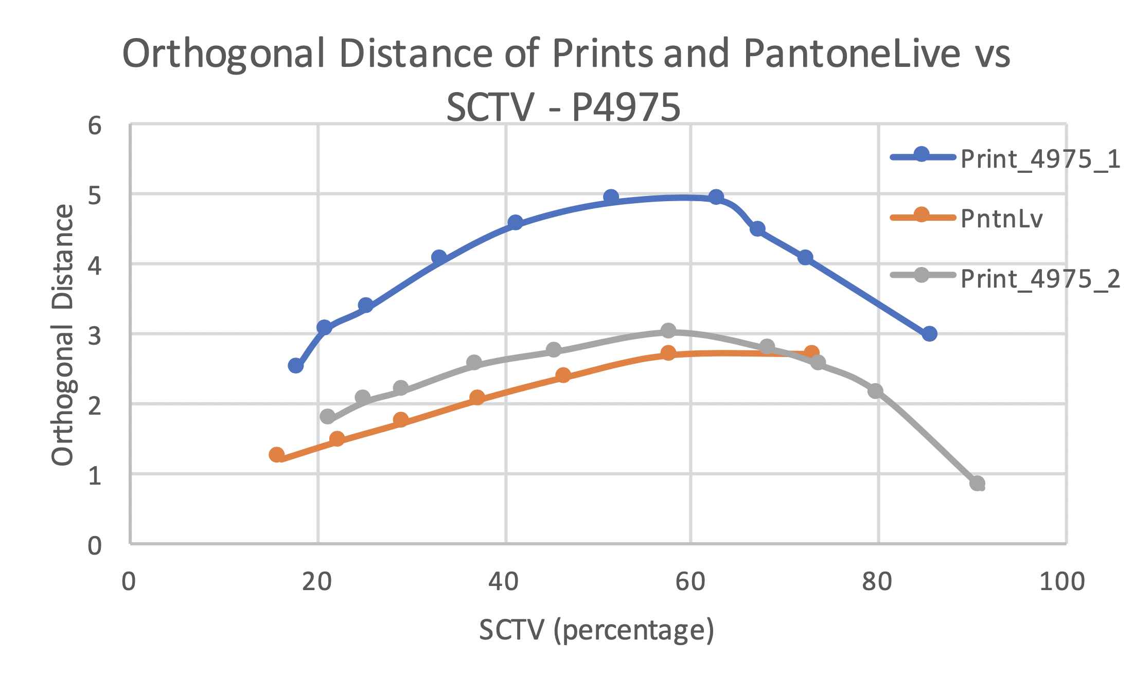
The plots for P4975 contain three data series – print from ink recipe 1, print from ink recipe 2 and the PantoneLIVE data. The hue angle difference curves for P4975 – FWCP are significantly different for prints and the PantoneLIVE data. The hue angle difference curve for PantoneLIVE suggested a linear negative increase in hue angle difference with a decrease in SCTV. On the other hand, the print data followed a curve showing sharp knee-shaped change in hue shift around 40% SCTV. The maximum hue angle difference was observed at 20% tone value for both the prints and the PantoneLIVE data series. The print curves show the hue angle difference moving from negative to positive between 30 and 40% SCTV. This change in sign can be attributed to the low chromaticity of the color. Since the points were close to the achromatic axis, small shifts in the CIELAB space caused large shifts in the hue angle. The Delta H for print data from both the ink recipes showed similar curve shape with maximum hue shift between 60% and 70% SCTV. However, the Delta H curve shape for PantoneLIVE data was different than that for the print data. The magnitude of hue shift suggested by Delta H metric was much lower than that seen in hue angle difference. This was due to the chromaticity scaling included in the Delta H formula and low chromaticity of P4975-FWCP. The Delta H curves for PantoneLIVE showed a straight line indicating a linear negative increase in magnitude of hue shift with decrease in SCTV.
The orthogonal distance curve for print- recipe 2 was much closer to the PantoneLIVE prediction than the ink recipe 1 results. It is worth noting that the chromaticity of print with ink recipe 2 was much closer to the PantoneLIVE standard than the ink recipe 1. The ink recipe 1 showed higher orthogonal distance than the ink recipe 2 and PantoneLIVE. The orthogonal distance curve shapes for both the ink recipes showed similar shapes with a maximum hue shift around 60% SCTV.
While comparing the two ink recipes, the hue angle difference curve shapes were not similar, but the Delta H and orthogonal distance curves were similar in shape. The Delta H curve showed difference in extent of hue shift between the two recipes. The three metrics unanimously showed higher hue shift for ink recipe 1 than for ink recipe 2. It is worth noting that the L* and ho values for both the recipes was similar. However, the C* for printed solid with ink recipe 1 was 15.64 while that for ink recipe 2 was 6.19. This supports the finding that higher chromaticity resulted in a higher hue shift.
The efficacy of the three metrics in characterizing the hue shifts for print and PantoneLIVE data was evaluated. For each metric, the absolute value of difference between maximum hue shift for print and PantoneLIVE was calculated. The calculation is as defined below:
Maximum hue angle difference between print and PantoneLIVE data = | Maximum hue angle difference for print data – Maximum hue angle difference for PantoneLIVE data |
This difference was used as an indicator of how each hue shift metric performed in terms of predictability of print with PantoneLIVE data. A higher difference indicates poor predictability for that metric.
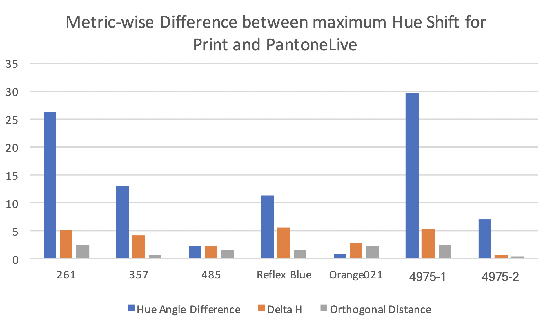
The image above clearly shows that hue angle difference showed the highest difference between the print and PantoneLIVE data. The lowest difference was seen with the orthogonal distance. The difference for Delta H lied between hue angle difference and orthogonal distance. The limitation of hue angle difference as a hue shift metric were highlighted with low chromaticity color i.e. P4975- FWCP. The metric overestimated the hue shift and showed sign changes as well. Orthogonal difference showed the closest results to the PantoneLIVE data. In terms of predictability of print results with PantoneLIVE data, orthogonal difference appeared to be a better metric than the rest. However, orthogonal distance is a strictly positive quantity and does not indicate the direction of shift. On the basis of observations from the CIELAB plots and the individual metric curves, Delta H appeared to the best metric in terms of distinguishing between low and high hue shift colors.
Summary of Results
Hue Shift Behavior
Based on the results of preliminary and main study, the hue shift behavior was observed to be higher for colors with high chromaticity. The yellow hue region showed negligible hue shifts, while the violet, red, orange and reflex blue hues showed a noticeable hue shift.
The colors ranked in decreasing order of maximum hue angle difference in print are – P4975-Recipe 2 , P4975- Recipe 1, PReflex Blue, POrange021, P485, P261, P357.
The colors ranked in decreasing order of maximum Delta H in print are – POrange021, PReflex Blue, P485, P4975- Recipe1, 4975- Recipe2, P261, P357
The colors ranked in decreasing order of maximum orthogonal distance in print are – P485, POrange021, PReflex Blue, P357, P261, P4975- Recipe1, P4975- Recipe2
Print versus Digital (PantoneLIVE) comparison
The print and PantoneLIVE curves for different hue shift metrics were examined for similarities and the data is summarized in the table below.
|
|
Similar |
Dissimilar |
|
Hue Angle Difference |
P485, POrange021 |
P261, P357, PReflex Blue, P4975 -1, P4975 -2 |
|
Delta H |
P485, POrange 021 |
P261, P357, PReflex Blue, P4975 -1, P4975 -2 |
|
Orthogonal Difference |
P261, P357, P485, POrange021, PReflex Blue, P4975-1, |
|
The data presented in the table above suggests that the colors P485 and POrange 021 showed similar hue shift behavior and extent between print and PantoneLIVE data. Orthogonal distance as a hue shift metric showed better correlation with the PantoneLIVE data than the other two metrics.
Effect of different ink recipe
The hue shift behavior for the two ink recipes of P4975-FWCP was similar. However, the extent of hue shift was shown to be higher in printed with recipe 1 than with recipe 2. This was attributed to the higher chromaticity of the print with recipe 1 than with recipe 2.
Comparison of Metrics
Hue angle difference showed limitations for colors close to the achromatic axis. Hue angle difference was observed to increase with a decrease in SCTV while the Delta H and orthogonal distance showed peaks in the midtone region. The hue shift behavior seen in Delta H and orthogonal distance plots was similar to that seen in CIELAB plots of the print data.
Conclusion
The nature and extent of hue shift for tints of six spot colors were characterized using three hue shift metrics. The study showed that colors with high chromaticity showed higher hue shifts than spot colors with lower chromaticity. The hue shift , as suggested by Delta H, orthogonal difference and CIELAB plots, was observed to be the highest in the midtone region. Spot color tints of P485, PReflex Blue, and POrange 021 showed noticeable hue shift while the colors P261, P357 and P4975 did not show significant hue shifts. The print and PantoneLIVE data for P485 and POrange 021 showed similar hue shift behaviors and magnitude. Orthogonal distance as a hue shift metric showed better correlation between print and PantoneLIVE data than the other two metric. Hue angle difference as a hue shift metric can exaggerate hue shifts while characterizing low chromaticity colors near the achromatic line. Delta H was the most successful metric in showing the distinction between high and low hue shift colors. The two ink recipes for P4975 did not show a significant difference in hue shift behavior. But, it is recommended to repeat the different ink recipe exercise with a higher chromaticity spot color.
Further Study
This study evaluated the hue shift in spot color tints with three different metrics. A visual analysis study is being conducted as the next phase of this project. The visual study results will help establish thresholds for visually perceptible and acceptable hue differences in spot color tints. The threshold from that study will be used to formulate statistical hypothesis and conduct hypothesis testing. If the observers do detect a visual difference between the print, PantoneLIVE and the hue corrected versions, it would be worth evaluating which version do they feel appears more natural when seen with the solid. It would also be worth repeating this study with high chromaticity colors in other hue regions to see if the relationship is replicated across the different regions. Additionally, a chromatic adaptation transform could also be tested with these hue shift metrics to check if the accuracy of these metrics improves.
Bibliography
- Adobe. (NA, NA NA). How to adjust colors in Illustrator. Retrieved January 06, 2020 from Adobe Illustrator User Guide - Color: https://helpx.adobe.com/illustrator/using/adjusting-colors.html
- ASTM. (2016). Standard Practice for Calculation of Color Tolerances and Color Differences from Instrumentally Measured Color Coordinates. ASTM International, 1-12.
- Cory , S., Roesch, J., & Specht, A. (2017, 11 02). If You Work With Brand Colors, You Need to Know About CxF. Retrieved 01 11, 2020 from CGS: http://www.cgsusa.com/2017/11/02/know-cxf/
- Danilova, M. V., & Mollon, J. D. (2016). Superior discrimination for hue than for saturation and an explanation in terms of correlated neural noise. Proceedings of the Royal Society B: Biological Sciences, 283(1831), 20160164.
- Durmus, A., & Davis, W. (2019). EVALUATION OF HUE SHIFT FORMULAE IN CIELAB AND CAM02. CIE - International Commission on Illumination. 10.25039/x46.2019.PO005, pp. 888-895. CIE - International Commission on Illumination.
- ISO. (2018). Graphic technology -- Colour data exchange format (CxF/X)-- Part 4: Spot colour characterisation data (CxF/X-4). International Organization for Standardization, 13.
- International Organization for Standardization. (2018). Graphic technology — Colour data exchange format (CxF/X) — Part 4: Spot colour characterisation data (CxF/X-4) (ISO Standard No. 17972-4:2018(en)). Retrieved from https://clemson.illiad.oclc.org/illiad/illiad.dll using Clemson University library Inter-library loan
- International Organization for Standardization. (2019). Colorimetry — Part 4: CIE 1976 L*a*b* colour space (ISO Standard No. 11664-4:2019). Retrieved from https://clemson.illiad.oclc.org/illiad/illiad.dll using Clemson University library Inter-library loan
- Jodra, R., Such, A., & Soler, P. (2009). Washington, DC: U.S. Patent and Trademark Office Patent No. 7,612,926.
- Kim, A., Kim, H.-s., & Park, S.-o. (2011, September). Measuring of the Perceptibility and Acceptability in Various Color Quality Measures. Journal of the Optical Society of Korea, 15(3), 310-317.
- Mouw, T. (2018, March 16). Tolerancing Part 3: Color Space vs. Color Tolerance . Retrieved September 25, 2019 from X-rite Color Blog: https://www.xrite.com/blog/tolerancing-part-3
-
O’Hara, L., Gasque, B., Congdon, B., Hall, J., Halford, C., & Hattenberger, E. (2014, Sept 22). Pantone. Retrieved July 14, 2019 from PantoneLIVE Library Validation Study: https://www.pantone.com/images/PantoneLive/PantoneLIVE_Library_
Validation_Study_Clemson_Final_Version.pdf - Ren, J. &. (2015). Color difference threshold determination for acrylic denture base resins . Bio-medical materials and engineering, 26(10.3233/BME-151287.), S35-S43.
- Weisstein, E. (2020, Jan 02). Point-Line Distance--3-Dimensional. Retrieved Jan 06, 2020 from Wolfram Mathworld: http://mathworld.wolfram.com/Point-LineDistance3-Dimensional.html


