


Ch.4
CLEMSON ORANGE: BRAND COLOR CONSISTENCYS
Dovie Jeffcoat
Abstract
This project examines just how well Clemson Orange’s color consistency is maintained. The project consisted of testing various samples of flexographically printed ‘Clemson Orange’ materials. A sampling of products ranging in substrates and sources was collected. These samples were read with a spectrophotometer to determine the Delta-E from true Clemson Orange. Once the data was collected, it was examined to determine the possible cause(s) of the color differences and their magnitude. Digital and lithographic samples were also collected to examine variation across printing processes. Finally, a survey was taken to gauge consumer recognition of Clemson Orange. Clemson students and fans were asked to identify the brand color from a lineup of orange swatches.
Introduction
Clemson University’s campus is bursting with orange, but is it truly Clemson Orange? As an institution, the university is tremendously proud and protective of its brand, as it should be. This protection is imperative for such iconic symbols as the Tiger Paw, Howard’s Rock, and Clemson Orange. It is vital for brand color to remain consistent and recognizable across platforms and locations.
Color can be used to communicate with or elicit emotions from the consumer, as well as create brand equity. In a study to determine the significance of standardization in global advertising, color had a substantial effect on brand equity when combined with the standardization of graphics (Carassi, 2016). Additionally, Jessica Lee Ridgway’s research on brand personality found that color has a strong impact on the personality associated with brands (Ridgway, 2011). Therefore, it can be said that color consistency plays a pivotal role in the relationship between a brand and its consumers.
Review
Color may be measured, discussed, and categorized in various ways. It may be considered as the location and intensity of a spectral reflectance spike on the visual spectrum. It may also be measured by the dot percentages of color separations such as Cyan, Magenta, Yellow, and Black. Color is often identified using color matching systems such as a pantone swatch book. These ways of thinking about color are valid and useful in their own ways; however, CIELAB will be used in this project as a device independent method of quantifying color.
CIELAB
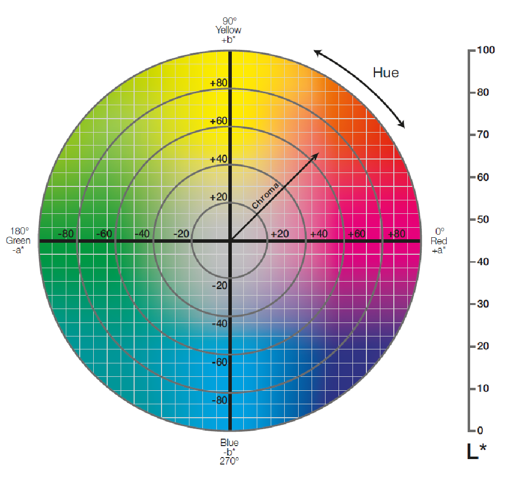
CIELAB is a color space designed to quantify and communicate hue, chroma, and lightness using a numerical coordinate system. Simply put, hue can be thought of as what color an object is (blue, red, yellow, etc.). Hue varies across the wavelengths of the visible spectrum, from violet (400 nanometers) to red (700 nanometers). Chroma, also called saturation, is a measure of a color’s intensity. It may also be defined as the purity of a color in relation to neutral gray. For instance, while a color closer to neutral gray looks faded or “dirty”, a purer color is more vibrant. Finally, lightness (also called luminance) determines how bright a color is. It is referred to as “achromatic”, meaning a lightness value can only identify how light or dark a color is (Sappi, 2013).
As shown in Figure 1, the CIELAB color space is a three-dimensional model containing three axes: L* for lightness, and a* and b* for color. The a* axis represents opposing colors red (+a*) and green (-a*), while the b* axis represents opposing colors Yellow (+b*) and blue (-b*).
Color Differences
While CIELAB provides a device independent way to communicate color, it also offers a precise method of measuring color differences. This value is known as Delta E, which pinpoints the exact coordinates of two colors and measures the distance between them. This project will use Delta E 2000, which compensates for the nonuniformity of human color perception (see formula below) (Schuessler). [1]

Methodology
Print Sample Collection and Measurement
To gain an understanding of the consistency of Clemson Orange in commercially sold products, samples of varying caliper, material, and manufacturer were collected from stores in and around the Clemson area. While the main focus of the project was flexography, digital and lithographic samples were also collected to determine the consistency of Clemson Orange across multiple printing processes. In total, 30 samples were collected, of which 15 (50.0%) were flexo, 7 (23.3%) litho, and 8 (26.7%) digital. Additionally, 18 (60%) of the samples were process color (CMYK) and 12 (40%) were spot color, as shown in Figure 2.


Once collected, the samples were read with a spectrophotometer for L*a*b* data. It is important to note that Clemson University’s official color palette contains two pantone options for Clemson Orange. Pantone 165 is typically used for athletics; however, it is so vibrant that it lies outside the process color gamut and cannot be accurately reproduced with CMYK inks. Therefore, the university offers pantone 1595 to be used for CMYK applications. The Delta E between these Pantone colors was measured to be 8.36, which is well above the limit for a noticeable visual difference. This significant difference may contribute to decreased consumer recognition of Clemson Orange.
An X-Rite eXact spectrophotometer was used to measure the Delta E from Pantone 165 and Pantone 1595 for each of the samples. A Pantone+ Solid Coated book was used to reference Clemson Orange. The samples were measured over a standard white backing tile, and the spectrophotometer settings were as follows:
- Illuminant: D50/2⁰
- Delta E Method: 2000
- Measurement Condition: M1
Survey
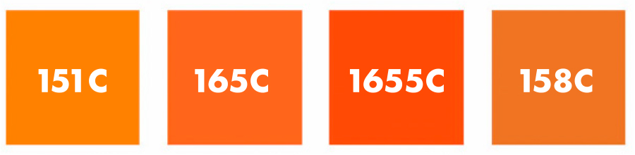
An in-person survey was conducted to gauge consumer recognition of Clemson Orange when compared to other orange swatches of varying shades. Participants were asked to identify Clemson Orange from a lineup of four orange swatches taken from a Pantone Coated book (see Figure 3). Pantone 165 was chosen to represent Clemson Orange because it has been the school’s designated color for longer than Pantone 1595. Although it would have allowed for a larger sample size, an online survey was not used because color may appear differently from screen to screen due to calibration differences.
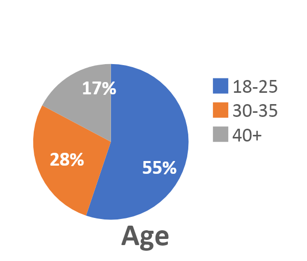
s seen in Figure 4, the survey consisted of 29 participants, 19 of which identified as female, and 10 identified as male. Additionally, 16 of the participants were between the ages of 18 and 25, 8 were between 30 and 35 years of age, and 5 were 40 years or older.

Results and Discussion
Printed Samples
After collecting the spectral data, the total average Delta E of all samples was found to be 7.21 ∆E from Pantone 165 and 5.82 ∆E from Pantone 1595. As previously stated, Pantone 165 is acceptable for spot color applications, whereas Pantone 1595 is better suited for process color. Therefore, the data can be further analyzed by assuming the spot color samples were matched to 165, and the CMYK samples were matched to 1595. Subsequently, the average ∆E of all spot samples from Pantone 165 was found to be 4.67 with a maximum of 7.37 ∆E. The average of all process samples from Pantone 1595 was 4.92 ∆E with a maximum of 11.41. The data is broken down further by printing process in Figure 5.

Generally, the smallest perceptible color difference to the human eye is said to be 1.0 ∆E. Acceptable tolerances for printing are often set between 2.0 and 3.0 ∆E. However, higher tolerances may be allowed depending on the customer and process (Huda, 2017). As seen in Figure 5, flexo had the lowest ∆E’s and digital had the highest. Additionally, for flexo and litho, the process color samples had lower ∆E’s than the spot color samples. This may be due to how bright and vibrant Pantone 165 is; it might be more easily contaminated and darken on-press. The data seems to support this theory. When looking at the L*a*b* data for the spot ∆E, the averaged values were all negative: L* -5.40, a* -5.18, b* -8.32. This shows a general decrease in lightness and saturation. Alternatively, the spot sample ∆E’s could be higher because process color must be tightly controlled, whereas spot inks are simply poured into the press and printed as solids. This may lead to a lack of measurement and control for spot inks due to the assumption that they are already within tolerance.
Survey
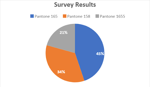
After completing an in-person survey, the results showed that 45% of participants correctly selected Pantone 165 as true Clemson Orange (see Figure 6). Furthermore, 34% of participants chose Pantone 158, and 21% of participants chose Pantone 1655, while nobody chose Pantone 151. This is likely because Pantone 151 had the largest ∆E from Pantone 165 (7.51), and therefore the most visually obvious color difference from Clemson Orange.
Of the participants who could not correctly identify Clemson Orange, the majority chose Pantone 158. This may be because 158 had the smallest ∆E from Pantone 165 (4.26). Additionally, Pantone 158 is visually darker and less saturated than 165. As previously discussed, Pantone 165 may tend to darken and desaturate on-press, which could be why participants chose 158. However, Pantone 1595 (Clemson Orange’s alternate brand color) is also darker and less vibrant than Pantone 165. Without further analysis, it is impossible to determine which of these factors was causing disruption of consumer recognition for Clemson Orange.
Conclusion
Regarding commercially sold printed products containing Clemson Orange, the data showed that the flexographic samples had the lowest ∆E’s when compared to offset lithographic and digital samples. Furthermore, samples produced using spot colors tended to have higher ∆E’s across all printing processes. This may be due to Pantone 165’s predisposition to darken and desaturate on-press. Additional research is required to confirm this theory.
A survey to gauge consumer recognition of Clemson Orange showed that less than half of Clemson students and fans could identify Clemson Orange from the swatch lineup. Due to several factors, further analysis is required to determine a single cause for the misidentification.
References
- Carassi, M. (2016). Does the standardization of advertising for a global brand significantly improve its consumer-based brand equity?(Order No. 10024529). Available from ProQuest Dissertations & Theses Global. (1769837325). Retrieved from http://libproxy.clemson.edu/login?url=https://search-proquest- com.libproxy.clemson.edu/docview/1769837325?accountid=6167
- Ridgway, J. L. (2011). Brand personality: Consumer's perceptions of color used in brand logos (Order No. 1521049). Available from ProQuest Dissertations & Theses Global. (1114502638). Retrieved from http://libproxy.clemson.edu/login?url=https://search-proquest- com.libproxy.clemson.edu/docview/1114502638?accountid=6167
- Defining and Communicating Color: The CIELAB System. Sappi Fine Paper North America (2013). Retrieved from https://cdn-s3.sappi.com/s3fs- public/sappietc/Defining and Communicating Color.pdf
- Schuessler, Z. Delta E 101. Retrieved from http://zschuessler.github.io/DeltaE/learn/
- Huda, M. (2017). Defining a Realistic Pass/Fail Tolerance: X-Rite Blog. Retrieved from https://www.xrite.com/blog/tips-to-define-tolerances


